S in Bubble Letters The Fun and Creative Way to Draw the Letter S
If you’ve ever wanted to make your writing look bold, fun, and eye-catching, learning to draw s in bubble letters is a great place to start. Bubble letters are thick, rounded, and full of personality. They show up in graffiti art, classroom projects, party decorations, scrapbooks, and social media designs. The letter S is one of the most popular letters to draw in this style because of its natural curves. Once you learn how to do it right, you’ll want to bubble-letter everything.
Need To Know: How to Draw E in Bubble Letters Step by Step for Beginners
What Are S in Bubble Letters
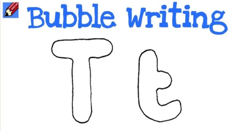
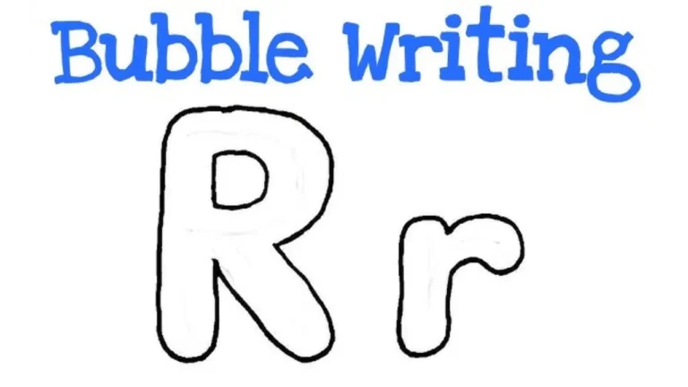
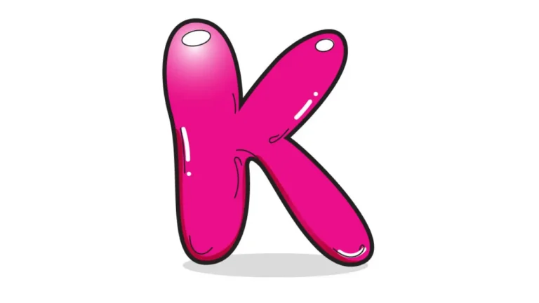
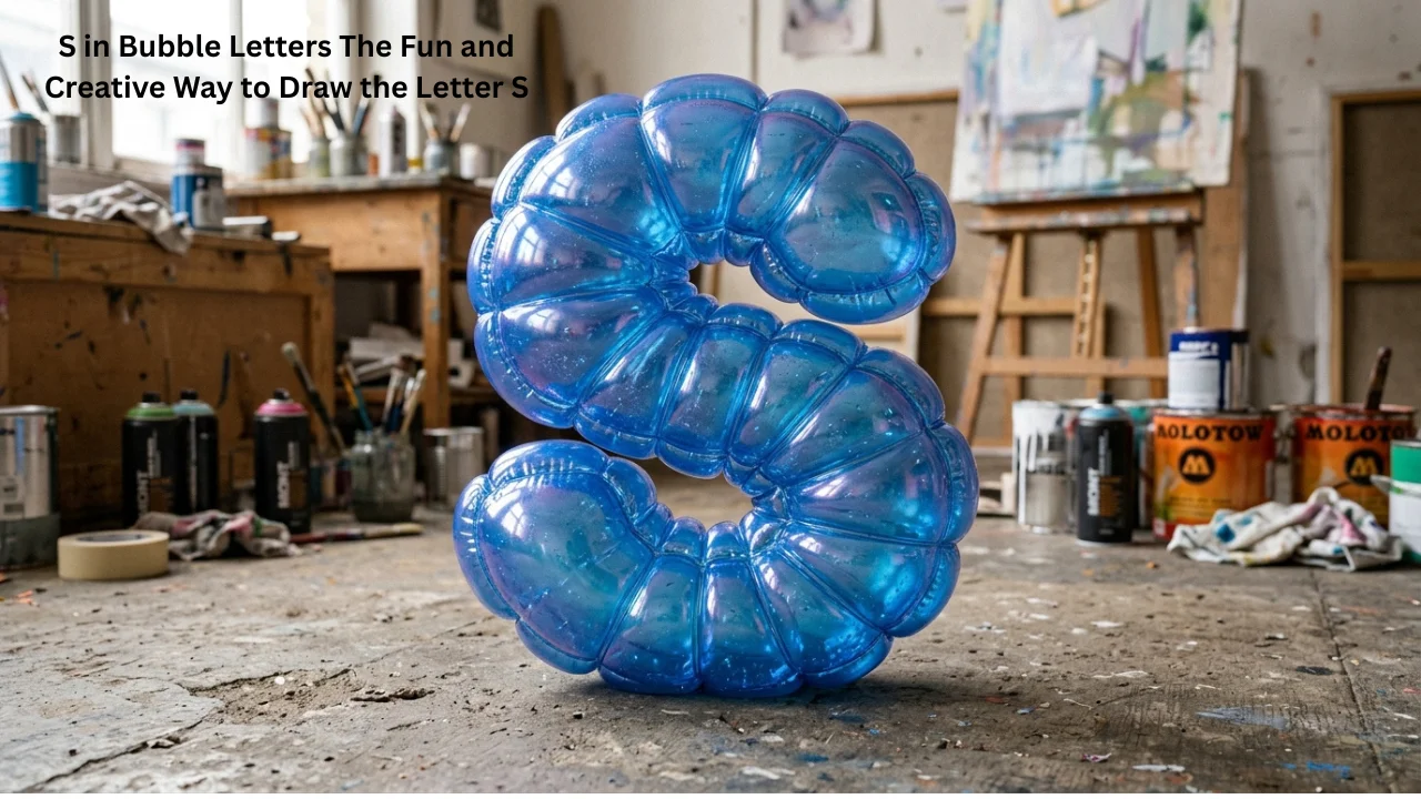
Bubble letters are a style of hand lettering where each letter looks puffy and rounded, almost like it’s filled with air. The edges are soft and the strokes are wide, giving the letters a three-dimensional feel even on flat paper. Artists, students, teachers, and designers all use bubble letters for different reasons. Some use them to make posters pop. Others use them to decorate journals or create custom logos.
Why Do People Love Them
The reason bubble letters are so loved comes down to one thing — they grab attention. A word written in bubble letters stands out instantly. And among all letters, the S is a crowd favourite because its flowing curves naturally fit the bubble style. When you draw s in bubble , the result always looks satisfying and creative.
Tools You Need Before You Start
You don’t need expensive supplies to get started. Here’s what works best:
| Tool | Purpose |
|---|---|
| Pencil | Sketch the basic shape first |
| Black marker or pen | Outline the final letter |
| Colored markers or crayons | Fill in the bubble with color |
| Eraser | Clean up pencil lines after inking |
| Plain white paper | Best surface for practice |
How to Draw S in Bubble Step by Step
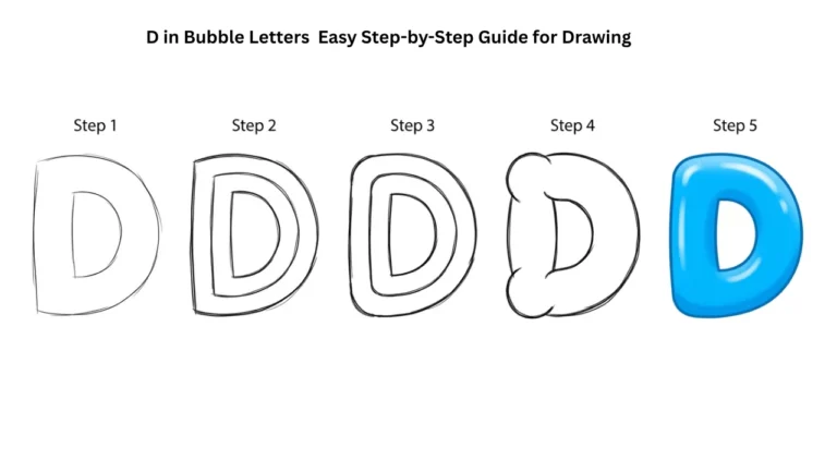
Step 1: Draw the basic S shape lightly in pencil. Keep it simple. Just a regular S, not too small and not too tall. Give yourself room to work.
Step 2: Add thickness around the letter. Draw a second line that follows the shape of the S but stays about half an inch away from it on all sides. Imagine you’re drawing a shadow or halo around the original letter.
Step 3: Connect the ends. At the top and bottom of the S, round off the ends so they look full and closed. This is what gives the bubble letter its puffy look.
Step 4: Erase the inner sketch lines. Now you should see just the outline of a thick, puffy S shape.
Step 5: Trace over the outline with a bold marker. Press firmly and keep the lines smooth. The cleaner your outline, the better the bubble effect looks.
Step 6: Add color and highlights. Fill the letter with your favorite color. Then add a small white circle or oval near the top-left of the bubble. This highlight makes the letter look shiny and three-dimensional.
Practice this a few times and you’ll get faster and more confident with every attempt.
Common Mistakes
Even experienced artists make mistakes when drawing bubble letters. Knowing what to watch out for saves you a lot of frustration.
Making the letter too thin is the most common problem. Bubble letters need to be wide and bold. If your S looks like a regular font, go back and add more thickness around it.
Uneven curves can make the S look lopsided. Try using a pencil and go slow. The S shape is naturally symmetrical — the top curve and bottom curve should be roughly the same size.
Skipping the highlight makes the letter look flat. Even a small white dot or oval can completely change how the bubble letter looks. It adds depth and makes it look like light is hitting the surface.
Rushing the outline leads to shaky lines. Use smooth, confident strokes when inking your bubble S. If you’re not confident yet, practice the motion in the air first before putting pen to paper.
Creative Ways to Use
Once you learn how to draw s in bubble letters, you’ll find dozens of ways to use this skill in real life.
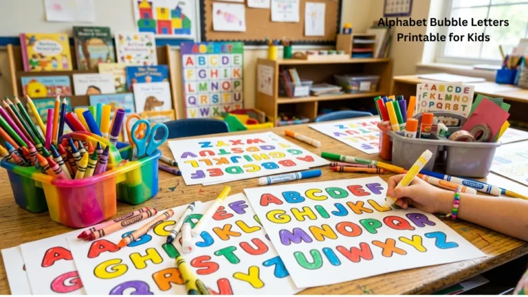
School projects become more visual and impressive when titles and key words are written in bubble letters. Teachers notice effort and creativity.
Handmade cards and gifts feel more personal when you add someone’s name or initials in bubble letters. A simple card with a big bubble S can mean a lot to someone whose name starts with that letter.
Posters and banners for events, classrooms, or parties look more professional with bubble lettering. The letters are large enough to read from a distance and fun enough to match any theme.
Journals and planners come alive when you use bubble letters for monthly covers, habit tracker titles, or section headers. It turns a plain notebook into something creative.
Digital design also benefits from this skill. Many designers sketch bubble letters by hand first, then scan and recreate them digitally. Knowing how to draw s bubble letters gives you a strong foundation for graphic design work.
Styles and Variations
Not all bubble S letters look the same. Once you master the basic version, you can try different styles to match different moods and projects.
| Style | Description | Best Used For |
|---|---|---|
| Classic bubble S | Thick, rounded, single color | Beginners, school projects |
| 3D shadow S | Same bubble shape with a drop shadow | Posters, bold designs |
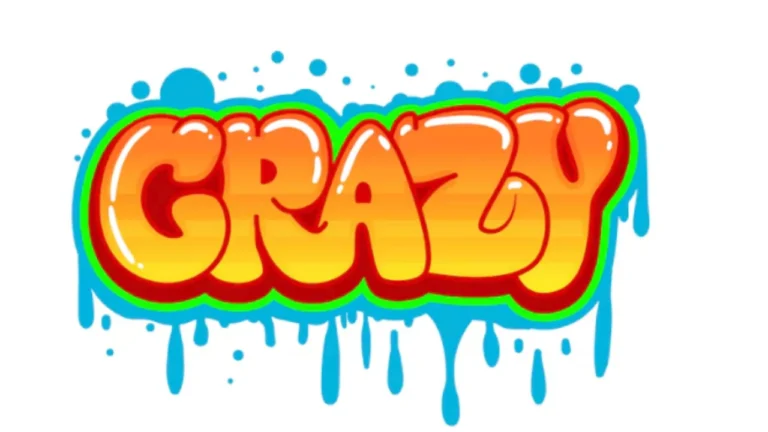
| Graffiti S | Edgy, angular bubble style | Urban art, personal style |
| Outline-only S | Bubble shape with no fill | Coloring pages, minimalist designs |
| Gradient S | Bubble filled with two or more colors | Social media, decorative art |
Tips to Improve Faster
Getting better at drawing s in bubble letters takes practice, but a few simple habits speed up the process.
Practice the S shape every day. Even five minutes of sketching helps your hand get comfortable with the curves. Muscle memory matters more than talent when it comes to lettering.
Study bubble letter references. Look at how other artists draw bubble letters online or in books. Pay attention to where they place highlights, how wide they make the strokes, and how they handle the ends of each letter.
Use graph paper when starting out. Graph paper helps you keep your letter balanced and symmetrical. Once you’re comfortable, switch to plain paper.
Watch your letter spacing. If you’re writing a full word with bubble letters, make sure each letter has a little breathing room. Letters that are too close together look crowded and messy.
Experiment with color combinations. Color is what makes bubble letters really come alive. Try warm colors like red, orange, and yellow for an energetic look. Use cool tones like blue, purple, and teal for something calmer.
Need To Know: Happy Birthday Bubble Letters Make Your Wishes Pop with Style
Conclusion
Drawing s in bubble letters is a skill anyone can learn with a little patience and practice. It starts with understanding the basic shape, adding thickness, and finishing with color and highlights. Whether you’re doing it for fun, for school, or for creative projects, this style of lettering adds personality and energy to everything it touches.
The letter S is one of the best starting points because its natural curves fit the bubble style perfectly. Keep practicing, try new styles, and don’t be afraid to make it your own. The more you draw, the better and faster you’ll get and soon enough, you’ll be adding bubble letters to everything.