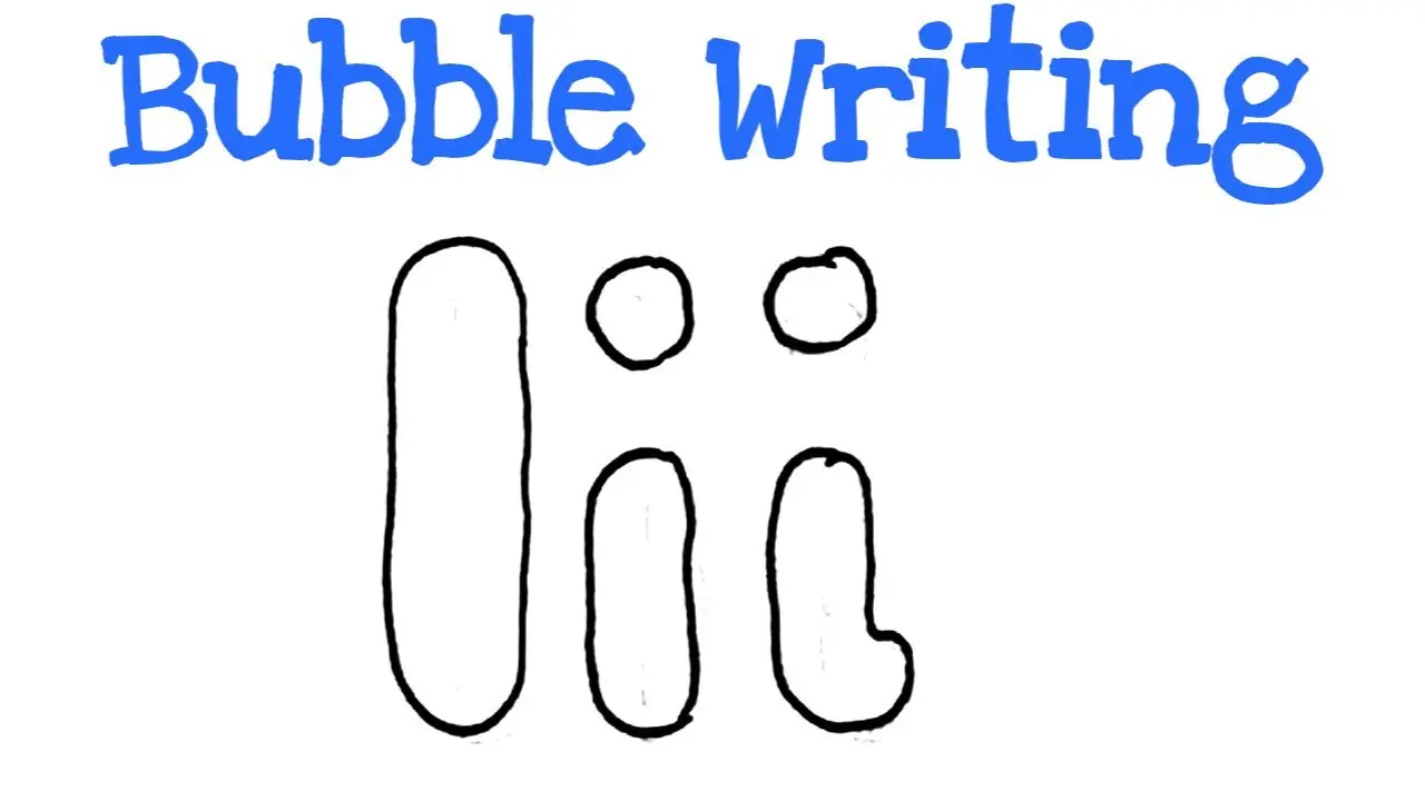
Bubble Letters I Designs, Styles and Drawing Tips
Bubble lettering is a fun way to turn simple alphabet shapes into bold and creative designs. The style uses thick outlines, rounded edges, and playful details that make every letter stand out. Bubble letters i are especially easy to learn because the basic shape of the letter I is simple and gives you plenty of room to add your own style.
People use bubble lettering for school projects, posters, notebooks, digital art, greeting cards, and social media graphics. You do not need advanced drawing skills to get started. With a pencil, eraser, and marker, you can create attractive letter designs in only a few steps.
What Are Bubble Letters?
Bubble letters are large, thick letters that look soft, rounded, or inflated. Artists usually draw an outline around a normal letter and then make the corners smoother.
Unlike standard handwriting, bubble lettering focuses more on appearance than speed. The goal is to make the letters decorative, easy to notice, and visually interesting.
When learning bubble letters i, beginners can start with a simple capital I. From there, they can experiment with lowercase forms, shadows, colors, patterns, and different outline thicknesses.
How to Draw Bubble Letters I
Drawing the letter I in bubble style is simple when you break the process into small steps. Start lightly so you can erase unwanted lines later.
First, draw a normal capital letter I with a pencil. Make sure the letter has enough space around it because you will add a thick outer shape.
Next, draw a second outline around the original letter. Keep the outline smooth and rounded instead of creating sharp corners.
After completing the outer shape, erase the original guideline inside. You should now have a thick, hollow letter that looks like a bubble.
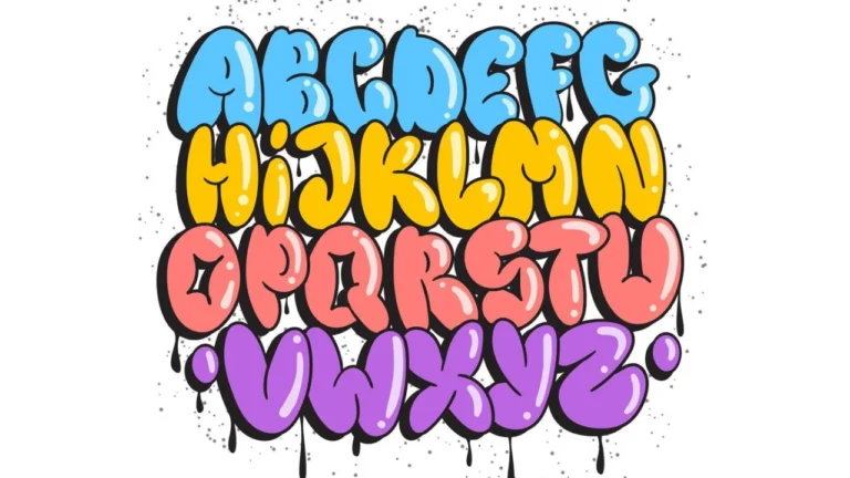
Alphabet Bubble Letters Easy Steps, Styles & Tips for Beginners
Finally, trace the finished outline with a dark pen or marker. You can now color the design or add extra details.
| Step | What to Do | Helpful Tip |
|---|---|---|
| 1 | Draw a simple letter I | Use light pencil lines |
| 2 | Add a thick outer outline | Keep the edges rounded |
| 3 | Erase the inner guideline | Work slowly to keep the shape clean |
| 4 | Trace the final outline | Use a black marker for stronger contrast |
| 5 | Add color or decoration | Try shadows, dots, or patterns |
This method works well for both children and adults who want to practice bubble letters i without using complicated drawing techniques.
Capital Bubble Letter I
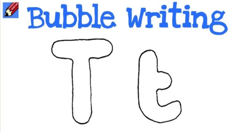
A capital bubble I is usually the easiest version to create. You can draw it as one thick vertical shape or include larger bars at the top and bottom.
For a traditional look, draw the center section thick and keep the top and bottom sections wider. Round all corners so the design looks softer.
You can also make the capital I taller, wider, or slightly tilted. These changes give the letter more personality while keeping it easy to recognize.
Lowercase Bubble Letter I
The lowercase version gives you more freedom because it includes a dot above the main body. The dot can become an important design feature.
When drawing lowercase bubble letters i, make the main line thick and rounded. Then draw a large circular or oval dot above it.
Instead of using a plain dot, you can draw a heart, star, flower, smiley face, or small cloud. This simple detail can completely change the appearance of your design.
Cute Bubble Letters Easy Step-by-Step Guide for Beginners
Creative Ways to Decorate Bubble Letters
Color is one of the easiest ways to make bubble lettering more attractive. You can use one solid color or mix several shades together.
Gradient coloring works well because it creates a smooth transition from one color to another. For example, you can move from light blue at the top to dark blue at the bottom.
Patterns are another useful choice. Add stripes, dots, stars, lightning shapes, flowers, or small geometric designs inside the letter.
You can also decorate bubble letters i with a theme. A summer design might include bright colors and small suns, while a winter design could include snowflakes and cool shades.
Adding Shadows and 3D Effects
A simple shadow can make a bubble letter look more professional. Draw a second line slightly behind the main letter, usually toward the right or lower side.
Fill the shadow with a darker shade than the main letter. This technique creates depth and makes the design look like it is lifting away from the page.
For a stronger 3D look, add small highlight marks on one side of the letter. White lines or small circles can create the effect of light reflecting from a shiny surface.
Best Materials for Bubble Letter Drawing
You do not need expensive art supplies to practice bubble lettering. Basic stationery is usually enough.
A regular pencil works well for creating the first sketch. A good eraser helps remove guidelines without damaging the final drawing.
Black markers create strong outlines, while colored pencils and markers add personality. Digital drawing apps can also help you create bubble letters i on tablets, computers, or mobile devices.
Where Can You Use Bubble Letter I Designs?
Bubble letters work well in many creative projects. Students often use them for school headings, science boards, name posters, and classroom decorations.
Artists may use them in logos, stickers, printable pages, banners, digital illustrations, and social media content.
You can also use the letter I as part of a full name, phrase, or alphabet set. Once you understand the basic drawing method, creating other bubble letters becomes much easier.
Tips for Making Bubble Letters Look Better
Try to keep both sides of the letter balanced. Uneven outlines can make the final shape look messy.
Use light pencil pressure during the first stage. Dark pencil marks become harder to erase later.
Do not worry about making every drawing perfect. Practicing bubble letters i several times will help you understand spacing, thickness, and rounded shapes naturally.
You should also experiment with different styles instead of copying the same design every time. Small changes in width, color, shading, and decoration can create completely different results.
Common Mistakes Beginners Should Avoid
One common mistake is drawing the outer lines too close to the original letter. Bubble letters need enough thickness to create their bold appearance.
Another mistake is making the corners too sharp. Soft and rounded corners usually produce a better bubble effect.
Beginners may also add too many decorations. Start with a clean shape first, then add patterns or details gradually.
Final Thoughts
Bubble lettering gives anyone an easy way to make alphabet designs more creative and eye-catching. The letter I is a great starting point because its basic structure is simple and easy to customize.
By practicing outlines, colors, shadows, and decorative patterns, you can develop your own unique drawing style. Whether you are creating posters, notebook art, digital designs, or school projects, bubble letters i can add a playful and bold look to your work.