K in Bubble Letters Fun Designs, Styles, and Tips
Learning how to draw k in bubble letters can make handwriting, posters, school projects, and creative artwork more attractive. Bubble lettering gives normal letters a soft, rounded, and playful appearance. The letter K can look especially creative because its straight lines and angled strokes provide plenty of space for different styles.
Bubble letters are popular among students, artists, designers, and people who enjoy hand lettering. You do not need advanced drawing skills to create them. With a pencil, paper, and a little practice, anyone can turn a simple letter K into an eye-catching bubble design.
What Does K in Bubble Letters Look Like?
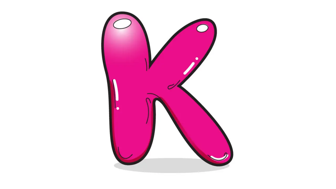
A k in bubble letters usually keeps the basic shape of a normal K but uses thick and rounded lines. Instead of sharp corners, the edges appear soft and curved. The result often looks similar to an inflated letter or a balloon.
Artists can create uppercase or lowercase versions. An uppercase K usually has one tall vertical section and two rounded diagonal arms. A lowercase K can look softer and more compact, making it useful for names, notebooks, or decorative text.
The beauty of bubble lettering comes from flexibility. There is no single correct way to draw the letter. You can make it wide, narrow, tall, short, simple, colorful, or highly decorated.
Cute Bubble Letters Easy Step-by-Step Guide for Beginners
How to Draw K in Bubble Letters Step by Step
Drawing k in bubble letters becomes easier when you start with a basic outline. First, lightly draw a regular capital K with a pencil. Keep the lines large enough so you have room to build the bubble effect.
Next, draw another rounded line around each original stroke. Instead of following the sharp angles exactly, soften the corners and create smooth curves. The outer lines should make every section of the K appear thick.
After completing the outline, erase the original guide lines inside the letter. You should now have a clean bubble-shaped K.
Add small details if you want more depth. A short white highlight near one edge can create a shiny balloon effect. You can also add shadows behind the letter to make it appear three-dimensional.
Uppercase and Lowercase Bubble Letter K
The uppercase and lowercase versions offer different visual styles. An uppercase K works well for headings, posters, banners, and initials because it appears bold and noticeable.
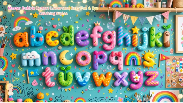
A lowercase k in bubble letters can feel more casual and playful. It works well in handwritten words, greeting cards, scrapbook pages, and children’s activities.
You can also combine uppercase and lowercase bubble letters within the same design. However, keeping similar thickness, spacing, and curves helps the lettering look balanced.
Beginners may find the uppercase version easier because its basic structure is clear. Once you feel comfortable drawing it, you can experiment with lowercase styles.
Alphabet Bubble Letters Easy Steps, Styles & Tips for Beginners
Creative Styles for Bubble Letter K
You can transform a basic bubble K into many creative designs. Color is one of the easiest ways to change its appearance. Bright shades can create a fun style, while pastel colors can make the letter look softer.
Another option is using patterns inside the letter. Stripes, dots, hearts, stars, waves, and checkerboard patterns can add personality.
Artists can also create themed versions of k in bubble letters. For example, a nature-inspired K could contain leaves, flowers, or vines. A space-themed version might feature stars, planets, and small galaxies.
Adding a dark outline around the letter can also make the shape stand out. A thicker border usually creates a cartoon appearance, while a thin border keeps the design simple.
Adding a 3D Effect to Bubble Letter K
Three-dimensional effects can make bubble lettering look more professional. Start by choosing one direction for the shadow, such as down and to the right.
Draw short lines extending from the outer edges of the letter in the same direction. Connect these lines to create the illusion of depth.
Shade the new sections slightly darker than the main letter. This contrast makes your k in bubble letters appear raised from the page.
Highlights can improve the effect even more. Leave a small white area near the top or side of each rounded section. This simple technique creates the appearance of light reflecting from a shiny surface.
Best Tools for Drawing Bubble Letters
You do not need expensive equipment to practice bubble lettering. A basic pencil and eraser are enough when learning the shape.
Once you feel confident, you can use markers, colored pencils, gel pens, crayons, or brush pens. Fine-tip black markers work especially well for outlining.
Digital drawing apps also allow you to create smooth bubble letters. A tablet or drawing software makes it easy to change colors, resize letters, add shadows, and correct mistakes.
Whether you work digitally or on paper, starting with a light sketch usually produces cleaner results.
Common Mistakes to Avoid
One common mistake is making the sections of k in bubble letters different thicknesses. Uneven strokes can make the letter look unbalanced. Try to keep approximately the same amount of space around each part of the original guide letter.
Another mistake involves creating corners that are too sharp. Bubble lettering should generally have soft and rounded edges.
Spacing also matters when using the letter K inside a word. If one letter is much larger or closer than the others, the overall design may look uneven.
Avoid pressing your pencil too hard during the first sketch. Light guide lines are easier to erase after you create the final outline.
Where Can You Use Bubble Letter K?
Bubble letters have many practical and creative uses. Students can use them for school posters, project covers, classroom decorations, and notebook headings.
Artists may use a bubble K in hand-lettered designs, illustrations, logos, stickers, or digital artwork. Parents and teachers can also use bubble letters for alphabet worksheets and coloring activities.
A decorative k in bubble letters can also represent someone’s initial. You can use it on birthday cards, personalized signs, room decorations, gift tags, and scrapbook pages.
Because the style is easy to customize, the same basic letter can fit many themes and occasions.
Tips for Improving Your Bubble Letter Skills
Regular practice is the easiest way to improve bubble lettering. Start by drawing large letters because larger shapes make curves easier to control.
Practice the same letter several times instead of trying to make the first drawing perfect. Compare each attempt and notice where the lines become uneven.
You can also experiment with different shapes. Try making the K wider, taller, rounder, or thicker. Once you understand the basic structure, you can develop your own lettering style.
Using reference designs can also help beginners understand proportions, shadows, highlights, and decorative techniques.
Final Thoughts
Drawing k in bubble letters is a simple and enjoyable way to make the letter K more creative. Start with a basic K, build a rounded outline around it, erase the guide lines, and then add colors, patterns, shadows, or highlights. With regular practice, you can create attractive bubble letters for posters, artwork, school projects, digital designs, and personalized decorations.