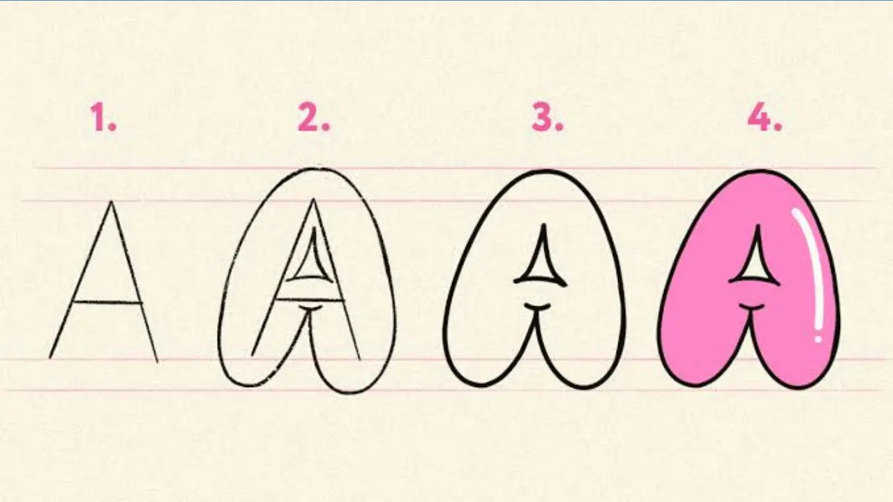
How to Make Bubble Letters Easy Drawing Steps
Learning how to make bubble letters starts with a simple idea: draw each letter as a thick, rounded shape rather than a single line. Begin with a light guide, build an outer outline around it, round the corners, and then erase the guide. Once the basic form looks even, you can color it, add a second outline, or use shading to make the letters look puffy.
Bubble lettering works for posters, cards, school projects, signs, sketchbooks, and hand-lettered designs. It does not require perfect handwriting. The key is keeping the letter thickness consistent and leaving enough space inside and between letters.
What makes a letter a bubble letter?
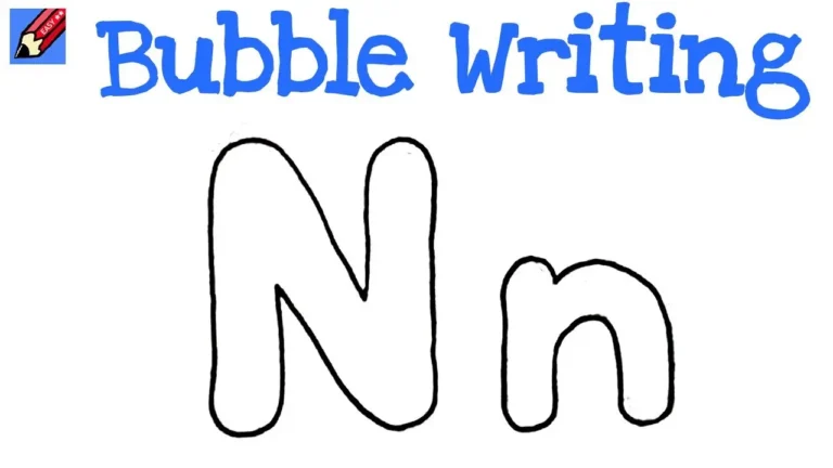
A bubble letter has a wide, soft outline with curved edges and roomy inner spaces. Unlike regular block lettering, it avoids sharp corners and thin strokes. Think of each letter as if it were made from an inflated tube or a soft balloon.
Most bubble letters have three parts: the outside edge, the inner opening or counter (such as the hole in an O, A, P, or B), and optional decoration such as color, shadow, highlights, or an extra outline.
Cute Bubble Letters Easy Step-by-Step Guide for Beginners
What you need
You can make bubble letters with basic drawing supplies. Pencil and paper are enough for practice.
- A pencil and eraser
- Plain paper, graph paper, or sketchbook paper
- A black pen, marker, or fineliner for the final outline
- Colored pencils, crayons, markers, or paint if you want color
- A ruler, optional, for straight guide lines and spacing
Choose paper that suits your coloring tool. Markers can bleed through thin paper, while colored pencils work well on most sketchbook or printer paper.
How to make bubble letters step by step
The same method works for almost any word. Start slowly with capital letters, since their shapes are often easier to space and outline. After that, try lowercase letters or more playful styles.
- Write the word lightly in simple block letters. Use a pencil and leave a small gap between letters. This first version is only a guide, so keep the lines faint.
- Draw a second line around each letter. Follow the outside of the guide letter, leaving an even border around it. This border becomes the thickness of your bubble letter.
- Round all corners and ends. Replace pointed angles with curves. On letters such as E, F, L, and T, soften the ends of the bars so they look rounded instead of squared off.
- Shape the inner openings. Letters with holes need inner outlines too. For an O, draw a smaller oval inside the larger one. For an A, B, D, P, R, or e, make the inside opening smaller and rounded.
- Check the width. Look for areas that are much thinner or thicker than the rest. Adjust the outside edge before inking. Even thickness helps the word look full and balanced.
- Erase the original guide lines. Erase only after you are happy with the outer shape. If you plan to use marker, erase thoroughly so pencil marks do not show through.
- Trace the finished outline. Use a pen or marker if you want a bold, clean edge. Let ink dry before coloring or erasing nearby marks.
- Add color and details. Fill the letters with one color, a pattern, or a simple gradient. A shadow and a few highlights can make the lettering look more three-dimensional.
Draw a simple bubble-letter A
A capital A is a useful letter to practice because it includes both an outer shape and an inner opening. Write a broad A lightly, but avoid making the point too sharp. Draw a rounded outline around both angled sides, then give the crossbar thick, soft ends.
Inside the upper part of the A, add a small rounded triangle or oval opening. Keep it centered and leave enough space between the opening and the outside edge. If the inner opening is too large, the letter can look thin.
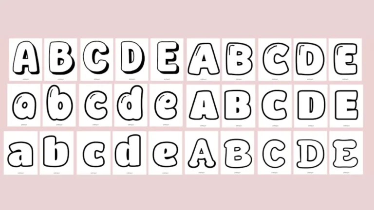
Alphabet Bubble Letters Easy Steps, Styles & Tips for Beginners
Keep the letters even and readable
Bubble letters are playful, but they still need to be easy to read. A few layout habits make a major difference.
- Use guide lines: Draw a light top and bottom line so letters share the same height.
- Leave breathing room: Keep small gaps between letters unless you want them to overlap deliberately.
- Match the thickness: Try to keep the outline width similar across the word.
- Protect inner spaces: Do not make holes in A, B, D, O, P, Q, R, or e so small that they disappear after coloring.
- Make round letters truly round: O, C, G, and S often look better as ovals or soft curves rather than rigid geometric shapes.
Graph paper can be helpful at first. It gives you a quiet grid for checking height, width, and spacing without becoming part of the finished artwork.
Three easy ways to decorate bubble letters
Once the outline is finished, decoration is what gives bubble letters personality. Start with one effect rather than adding every detail at once.
1. Add a drop shadow
Draw a second version of the outline slightly down and to one side of the letter, then connect the matching edges. This creates a shadow that makes the letters appear raised. Keep the shadow direction the same for every letter in the word.
2. Use highlights for a puffy look
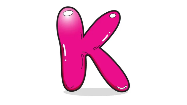
Leave a small white oval, curved dash, or dot near the upper-left edge of each letter. This suggests that light is hitting the surface. For a consistent result, put every highlight on the same side and keep the shapes fairly similar.
3. Create an inner outline
Draw a thinner line just inside the main outline, following the letter’s shape. This can frame the color fill and add depth without making the design hard to read. Leave enough room between the outer and inner lines so they do not merge.
Coloring ideas that stay clear
A solid fill is the simplest choice, especially when you are learning. Use a darker color for the outline and a lighter color inside, or use black outlines with any fill color that you like.
For a basic gradient, place the darker shade near the bottom or one side of each letter and blend toward a lighter shade. With colored pencils, layer lightly and build the color slowly. With markers, work quickly while the ink is still wet if the marker type allows blending. Test colors on scrap paper first if bleeding or smudging is a concern.
Patterns also work well inside large letters. Try dots, stripes, checkerboard squares, stars, hearts, or small swirls. Keep the pattern inside the letter edge so the word remains readable from a distance.
Common bubble-letter mistakes and how to fix them
Letters look too narrow: Make the outer outline farther from the guide letter, especially on straight strokes. Bubble letters need enough width to look soft and full.
Letters look uneven: Check the thickness around the entire letter before inking. Correct one side at a time instead of trying to redraw the full word.
The word is hard to read: Simplify the shape, enlarge the inner openings, and avoid letting neighboring letters overlap too much. Decoration should support the letter form, not hide it.
Rounded letters have flat spots: Draw with a relaxed wrist and use several light strokes before choosing the final curve. Trying to make one perfect heavy line immediately often produces bumps.
Ink smears or the paper wrinkles: Let ink dry before adding color, and avoid soaking thin paper with repeated marker layers. A lighter touch or heavier paper can help.
Try different bubble-letter styles
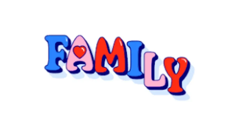
After you can make a clean basic alphabet, change one feature at a time. You might make the letters taller, wider, tilted, or slightly uneven for a hand-drawn cartoon style. You can also overlap letters, though it helps to decide which letter sits in front before you add outlines.
For a more graffiti-inspired look, use larger shapes, bolder outlines, and connected or overlapping forms while keeping the word readable. For a softer style, use pastel colors, rounded highlights, and gentle shadows. The underlying construction remains the same: a clear letter shape surrounded by a consistent, rounded border.
Practice exercise: make one word three ways
Choose a short word such as “HI,” “LOVE,” “WOW,” or your name. Draw it three times on the same page. First, make plain outlined bubble letters. Second, add a drop shadow. Third, add color and highlights.
This exercise helps you see that the letter shape comes first. Color and effects can improve a strong outline, but they cannot easily fix a letter that is too cramped or uneven.
Frequently asked questions
Do bubble letters have to be uppercase?
No. Uppercase letters are often easier for beginners, but lowercase bubble letters can look friendly and expressive. Keep the loops and openings large enough to read clearly.
How do you make bubble letters without drawing a guide letter first?
Sketch the outer silhouette of the letter directly, then add its inner opening where needed. This is faster once you have practiced, but a light block-letter guide usually gives beginners more consistent results.
Can bubble letters have sharp corners?
They can, but sharper corners make the style look more like block lettering. Rounding most corners and stroke ends gives the familiar soft, inflated bubble effect.
What is the easiest word to use for practice?
Short words with simple capitals, such as “HI,” “WOW,” or “POP,” are a good starting point. They let you focus on thickness and curves without managing a long layout.
How can I make my bubble letters look 3D?
Add a connected shadow on one consistent side of each letter, then use darker color in the shadow area. Small highlights on the opposite side can strengthen the raised effect.
Start with shape, then add style
The easiest way to learn how to make bubble letters is to build clean, rounded outlines around simple guide letters. Focus first on even thickness, open inner spaces, and clear spacing between letters. Once those basics feel natural, shadows, color, patterns, and highlights can turn a plain word into a bold personal design.