Bubble Letters B Drawing Steps, Coloring Ideas
Bubble letters B are large, rounded versions of the letter B, drawn with thick outlines and soft curves instead of straight, narrow handwriting lines. They are popular for posters, signs, school projects, coloring pages, cards, graffiti-inspired art, and lettering practice. The easiest method is to sketch a blocky B first, round its corners, then add its two inner openings.
A bubble B can be uppercase or lowercase, simple or highly decorated. Start with a clear shape before adding color, patterns, shadows, or highlights. That order keeps the letter readable.
How to draw bubble letters B step by step
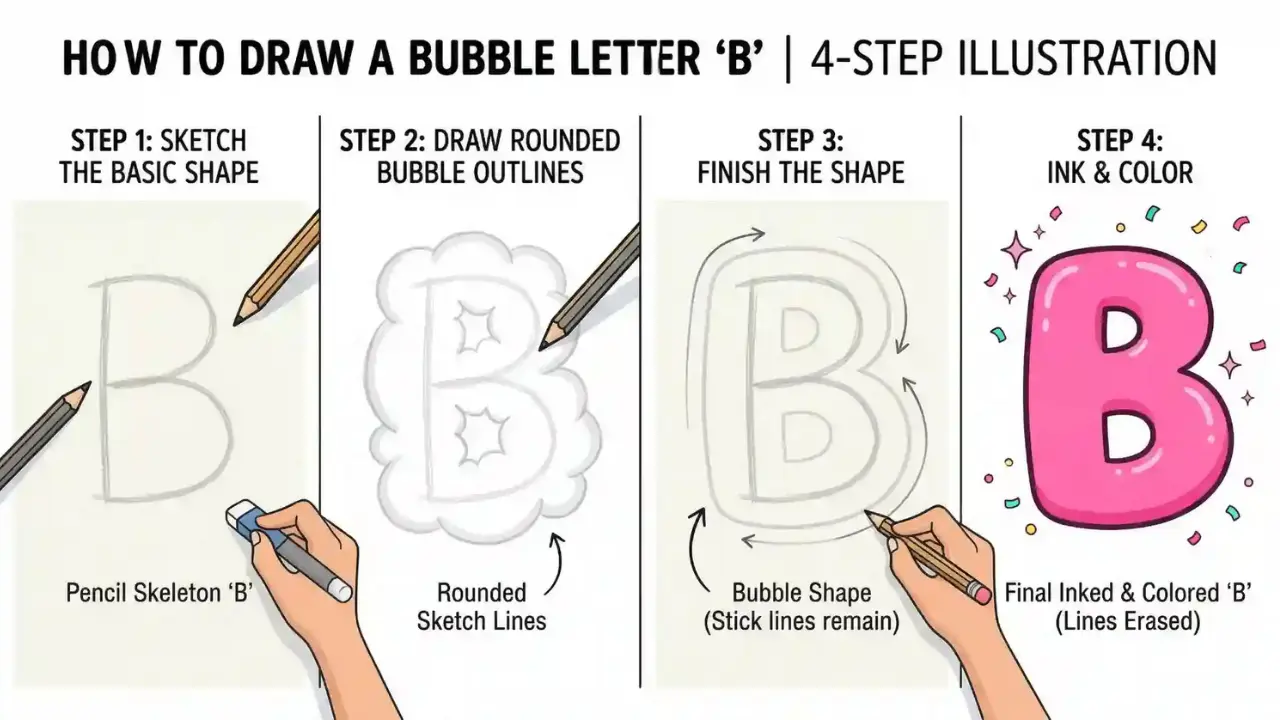
For a clean capital B, begin with a tall vertical stem and build two rounded lobes on its right side. Keep the outer curves broad and leave enough room inside each lobe for a smaller counter, or opening.
- Draw a tall vertical line. This is the left side, or spine, of the capital B. Make it as tall as you want the finished letter to be.
- Add a thick outline around the spine. Draw a parallel line beside it and connect the top and bottom ends. This creates a narrow, rounded rectangle rather than a single thin stroke.
- Create the upper bowl. From the top of the spine, draw a wide curve outward to the right. Bring it back toward the middle of the spine. Round the corner where it meets the spine.
- Create the lower bowl. From the middle, make a second outward curve that returns to the bottom of the spine. The lower bowl is often slightly larger than the upper one.
- Draw the two inner openings. Place a small rounded hole inside the upper bowl and a larger rounded hole inside the lower bowl. These spaces help the letter read clearly as B.
- Refine the outline. Erase sharp angles, uneven overlaps, and guide lines. Smooth curves make the letter look inflated.
- Ink and decorate. Trace the final outline with a darker pen or marker if desired, then add color, a shadow, or a pattern.
Use light pencil pressure at first. It is much easier to adjust the width of the bowls or the spacing of the inner holes before darkening the design.
Make the shape look puffy rather than like a block B
The difference between an ordinary block letter and a bubble letter is mostly in the edges. Bubble lettering has generous curves, consistent thickness, and rounded joins that suggest air or softness.
- Round every corner: Avoid pointed top, middle, and bottom joins.
- Use thick strokes: A very thin B will look like standard handwriting, even if its edges curve.
- Keep the openings rounded: Ovals, bean-like shapes, and rounded rectangles work well.
- Leave a visible gap between shapes: The inner openings should not crowd the outer outline.
- Balance both bowls: The top and bottom do not need to match, but they should look connected to the same spine.
A common beginner mistake is making the two right-side loops look like separate circles stuck to a rectangle. Let the curves flow naturally into the stem and into the center joining area instead.
Uppercase and lowercase options
An uppercase B is usually the clearest choice for a sign or a single-letter design. A lowercase b has a tall stem and one rounded bowl, giving it a simpler silhouette.
| Style | Basic shape | Best use |
|---|---|---|
| Capital B | Tall spine with two rounded bowls | Initials, banners, bold poster lettering |
| Lowercase b | Tall stem with one rounded bowl | Alphabet practice, playful words, softer designs |
| 3D capital B | Capital B plus a second offset outline | Headings, graffiti-style art, display lettering |
| Outline B | Thick exterior line with an uncolored center | Coloring pages, cutouts, pattern fills |
For a lowercase version, draw a long, thick vertical stem first. Add one rounded bowl on the lower right half, then place a smaller rounded opening inside it. Keep the bowl wide enough that it does not resemble the letter d.
Easy ways to decorate a bubble B
Once the outline is solid, decoration can give the letter its own personality. Use a limited number of ideas at a time so the B stays easy to recognize.
Color fills
Fill the letter with one solid color for a clean look, or blend two colors from light to dark. Colored pencils and markers can create a soft gradient when the transition is gradual. With markers, test the colors on scrap paper first because overlapping ink can change the shade.
Patterns inside the letter
Patterns work especially well in a large outline B. Try polka dots, stripes, stars, hearts, checkerboards, small flowers, or animal-print-inspired spots. Draw the pattern inside the outer boundary and avoid filling the inner openings; those empty areas preserve the shape of the letter.
Highlights
A small white oval or curved streak near the upper left of each bowl can make the letter appear shiny. Keep highlights in the same general direction so they look like light falling from one side.
Drop shadows
To add a simple shadow, redraw the outer edge slightly down and to the right. Connect the original outline to the shifted outline along the visible sides, then color the new side area with a darker shade. Choose one direction and use it throughout the letter.
3D depth
A 3D effect is similar to a drop shadow but uses visible side faces rather than a soft dark shape. Keep the depth modest. If the offset is too large, the two bowls and their inner openings can become confusing.
Using a grid for better proportions
A simple grid helps keep a bubble B even, particularly when it needs to fit on lined paper, a poster board, or a digital canvas. Divide the height into three broad zones: upper bowl, middle join, and lower bowl. The lower section can be a little taller or wider for a friendly, balanced look.
Make the spine about one-third of the total width, then reserve the remaining space for the rounded bowls. This is only a guide, not a fixed rule. Cartoon-style lettering often exaggerates the width, while neat display lettering may use a narrower form.
Materials for paper and digital lettering
You only need a pencil and eraser to practice. A ruler can help establish the height of the stem, although freehand lines often suit the relaxed bubble style better.
- Pencil and eraser: Best for planning the shape and correcting proportions.
- Black fineliner or marker: Useful for a crisp final outline after erasing pencil marks.
- Markers, crayons, or colored pencils: Good for fills, shading, and patterns.
- White gel pen or paint marker: Helpful for highlights on dark fills.
- Digital drawing app: Use a separate sketch layer, then draw the final outline on a new layer for easy edits.
When drawing digitally, use a brush with smoothing or stabilization if the app offers it. It can help create cleaner curves, but a little unevenness can also make hand-drawn lettering feel lively.
Cute Bubble Letters Easy Step-by-Step Guide for Beginners
Common problems and quick fixes
Most lettering problems come from spacing and proportion rather than artistic skill. Correcting them early produces a much clearer result.
- The B looks like an 8: Make the left spine more obvious and connect the bowls clearly to it.
- The inner holes are too small: Enlarge them before coloring. Tiny openings can disappear once an outline is added.
- The two bowls look uneven: This can be intentional, but check that their widths and attachment points feel balanced. A slightly larger lower bowl is usually easier to read.
- The letter looks flat: Add a highlight, a darker edge, or a small offset shadow.
- The outline wobbles: Sketch larger. Big letters are easier to control, and the final outline can be simplified as you trace it.
- The center is pinched: Widen the middle join so the two bowls flow together instead of meeting at a sharp notch.
Bubble letter B ideas for projects
A single decorated B can stand for a name, a classroom display, a birthday banner, or a themed art piece. Choose decorations that match the purpose. For example, a beach-themed B could use blue waves and tiny shells, while a space-themed B could use dark color, stars, and a pale highlight.
For a word, sketch all letters at the same height before decorating any of them. Maintain similar outline thickness and shadow direction across the word. This matters more than making every letter identical.
Alphabet Bubble Letters Easy Steps, Styles & Tips for Beginners
Frequently asked questions
How do you make a bubble letter B easy?
Draw a thick vertical stem, attach two large rounded loops on the right, and add one rounded opening inside each loop. Use pencil first, then smooth the outline before coloring.
Should the bottom of a bubble B be bigger than the top?
It often is slightly bigger because that gives a capital B a stable, familiar shape. Equal-sized bowls can work too, especially in a cartoon or geometric style.
How can I turn a bubble B into a 3D letter?
Draw a second outline a short distance down and to one side of the original B. Connect the visible outer edges between the two outlines, then shade those connecting areas darker.
Can bubble letters be used for formal writing?
They are usually best for decorative uses rather than formal documents. Their bold, playful form is designed to attract attention and can be harder to read in long text.
Why does my lowercase bubble b look like a d?
Check the direction of the stem. A lowercase b has its tall stem on the left and its round bowl on the right. A lowercase d reverses that arrangement.
Final Thought
The best bubble letters B begin with a recognizable capital or lowercase form and then soften it with thick, rounded outlines. Build the shape first, leave clear inner openings, and add decoration only after the B is easy to read. Whether the finish is plain, patterned, shiny, or three-dimensional, a balanced outline is what makes the design work.