Bubble Letters Generator Make, Customize, and Draw
A bubble letters generator helps turn ordinary words into large, rounded lettering that is easy to copy, color, trace, or use in a design. These tools are useful for poster titles, greeting cards, school projects, signs, social graphics, and simple hand-lettering practice. Type a word, choose a bubble-style outline or font where available, then save, print, or use the result as a drawing reference.
The best result depends on what you need: a quick copy-and-paste text style, a printable outline, or a guide for drawing letters by hand. Bubble letters are less about one fixed alphabet and more about a recognizable look—soft curves, thick strokes, roomy shapes, and playful decoration.
What bubble letters are
Bubble letters are oversized display letters with rounded edges and thick, inflated-looking forms. They are usually drawn as outlines first, leaving an open inner area that can be colored, shaded, patterned, or filled with smaller designs.
Unlike regular handwriting, bubble lettering prioritizes shape over speed. Each letter needs enough width and open space to look full rather than cramped. The style can be neat and simple or highly decorated, but the word should remain readable.
How to use a bubble letters generator
Most generators follow a simple process: enter text, select a style if the tool offers choices, and export or copy the result. The exact controls differ, but the goal is to create a letterform you can use immediately or adapt yourself.
- Enter a short word or phrase. Names, headings, initials, and one- or two-word messages usually work best.
- Choose the clearest style. A plain outlined alphabet is best for coloring or tracing. A filled style may work better for a finished digital graphic.
- Adjust size and spacing. Increase the letter size for printing. Leave extra space between letters when the word will be hand-colored or cut out.
- Review readability. Check rounded letters such as B, D, O, P, and R, as well as tight combinations such as “LL” or “MM.”
- Copy, download, or print. Use the available output option, then test-print before making several copies if the project requires a particular page size.
Some online text tools produce decorative Unicode characters rather than actual font files or editable artwork. These can be handy for a profile name or message, but they may display differently across apps and devices. For a poster or printable page, an image, document, or true font is usually more dependable.
Cute Bubble Letters Easy Step-by-Step Guide for Beginners
Choose the right output for your project
“Bubble text” can mean several different things. Picking the right format at the start avoids a design that looks good on screen but cannot be used the way you intended.
| Goal | Most useful format | Why it fits |
|---|---|---|
| Coloring page or classroom activity | Black outline on a plain background | Leaves room for crayons, markers, patterns, and names. |
| Hand-drawn sign or card | Large reference image or printable template | Makes it easier to copy proportions and spacing. |
| Digital post or graphic | Image or editable design file | Allows color, shadows, stickers, and background changes. |
| Chat, caption, or profile text | Copy-and-paste text characters | Fast to use, though appearance can vary by platform. |
| Cut-out letters | Thick outline with generous spacing | Provides a clear cutting edge and stronger paper shapes. |
How to draw bubble letters without a tool
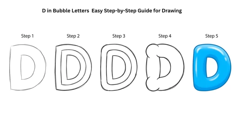
You can draw bubble lettering with a pencil, eraser, paper, and a marker. Start with simple block letters, then build rounded thickness around them. This approach gives you more control than a generator and helps you develop a consistent personal style.
- Write the word lightly in simple capital letters. Capitals are often easiest because their basic shapes are clear. Leave a gap between each letter.
- Draw a second line around each letter. Keep this outer line roughly the same distance from the original strokes. Round corners instead of making sharp angles.
- Connect the outer shapes. Smooth the curves so the letter looks puffy and continuous. Preserve openings inside letters such as A, B, D, O, P, R, and e.
- Erase the original guide lines. You should be left with a thick outline. Refine uneven areas before using ink.
- Add a clean final outline. Use a marker or darker pencil once the shapes look balanced.
- Decorate the interior and edges. Add color, dots, stripes, highlights, a shadow, or a second outline.
For a quick practice exercise, draw the same three-letter word several times. Keep one version plain, add a drop shadow to the next, and try a pattern in the third. Repetition makes spacing and proportions easier to judge.
Alphabet Bubble Letters Easy Steps, Styles & Tips for Beginners
Make bubble lettering look balanced
The most common problem is treating every letter as if it has the same shape. Bubble letters should feel like they belong together, but round letters, narrow letters, and wide letters need different amounts of space.
- Keep stroke thickness consistent. If the outline is wide on one side of a letter, avoid making it very thin elsewhere.
- Protect counters. The enclosed or partly enclosed spaces in letters, such as the hole in an O, are called counters. Keep them open so the word stays readable.
- Give wide letters room. M, W, and many uppercase B shapes often need more horizontal space than I, J, or L.
- Use a baseline. A faint line beneath the word helps prevent letters from drifting up and down.
- Check the word from a distance. If letters merge into one shape, increase the gaps or simplify the decoration.
Simple ways to decorate bubble letters
Decoration should support the letter shape, not hide it. A clean outline with one or two details often looks stronger than a crowded design.
Color fills and patterns
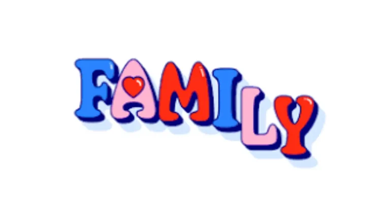
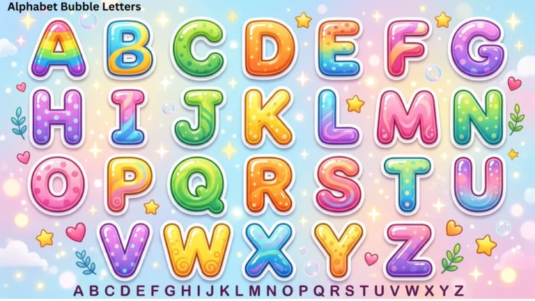
Solid color is the simplest option. You can also use stripes, polka dots, checkerboards, stars, hearts, flames, or a two-color split. Repeat the same pattern across a word for a coordinated result.
Highlights
A small white oval, crescent, or curved stripe near the upper-left or upper-right area can make a letter look glossy. Keep highlights in the same position on each letter so the imagined light source feels consistent.
Drop shadows
Draw a second offset outline behind the letters, usually down and to one side, then connect visible edges. Use one direction throughout the word. A shadow adds depth, but a very large offset can make small letters hard to read.
Double outlines
Add a narrow border around the main outline, leaving a small gap between the two lines. This works especially well with dark outer lines and a lighter interior, but it also looks effective in a single color.
Common mistakes and easy fixes
Bubble lettering is forgiving because it is stylized, yet a few issues can make even colorful work look messy. Fixing the structure before adding details saves time.
- Letters touch too much: leave more blank space between the outer outlines, not just between the original guide letters.
- Openings disappear: redraw the inner holes of letters larger, especially after thickening an outline.
- Mixed line weights: trace over thin areas or lightly redraw bulky sections until the stroke width feels even.
- Uneven word height: use a top guide and a baseline, then adjust letters before outlining in marker.
- Too many decorations: remove one layer—such as extra patterns, shadows, or highlights—and prioritize readability.
- Smudged coloring: let ink dry before coloring and test markers on spare paper if bleeding is a concern.
Tips for printing and tracing
For a printable design, choose a large letter size and a clear black outline. Thin lines can vanish after printing or become difficult for young children to color. A plain white background uses less ink and makes the outline easier to see.
To trace a printed design, tape the page to a bright window during daylight or place it over a light source designed for tracing. Do not press hard at first; a light pencil trace is easier to correct. If you plan to cut out the letters, print or trace onto heavier paper and leave a small border outside the outline.
Frequently asked questions
Is bubble lettering the same as graffiti lettering?
They overlap, but they are not identical. Bubble lettering is a broad rounded style used in many settings. Graffiti lettering includes many distinct styles and cultural traditions, often with more complex forms, outlines, fills, and effects.
Should bubble letters be uppercase or lowercase?
Either can work. Uppercase letters are usually easier for beginners because their structure is simpler and more uniform. Lowercase bubble letters can feel softer and more playful but may need extra attention to readability.
Can I use bubble letters for a logo?
They can suit playful, youth-oriented, handmade, or casual projects. For a logo, make sure the lettering remains legible at small sizes and that you have the right to use any font, template, or graphic element included in the design.
Why does copied bubble text look different on another device?
Copy-and-paste styles may rely on Unicode characters and the fonts available on the receiving device or platform. A saved image is more likely to preserve the intended appearance.
What is the easiest word to practice?
Start with three to five letters that include a mix of straight and round forms, such as “SUN,” “WOW,” or a short name. Short words make it easier to focus on consistent thickness and spacing.
Make the style your own
A bubble letters generator is a practical starting point for a printable outline, a digital word design, or a hand-lettering reference. Once the basic form is clear, the strongest improvements come from even spacing, open inner shapes, and a limited set of decorations. Begin with a readable word, then add color, pattern, shadows, or highlights in a way that still lets every letter stand out.