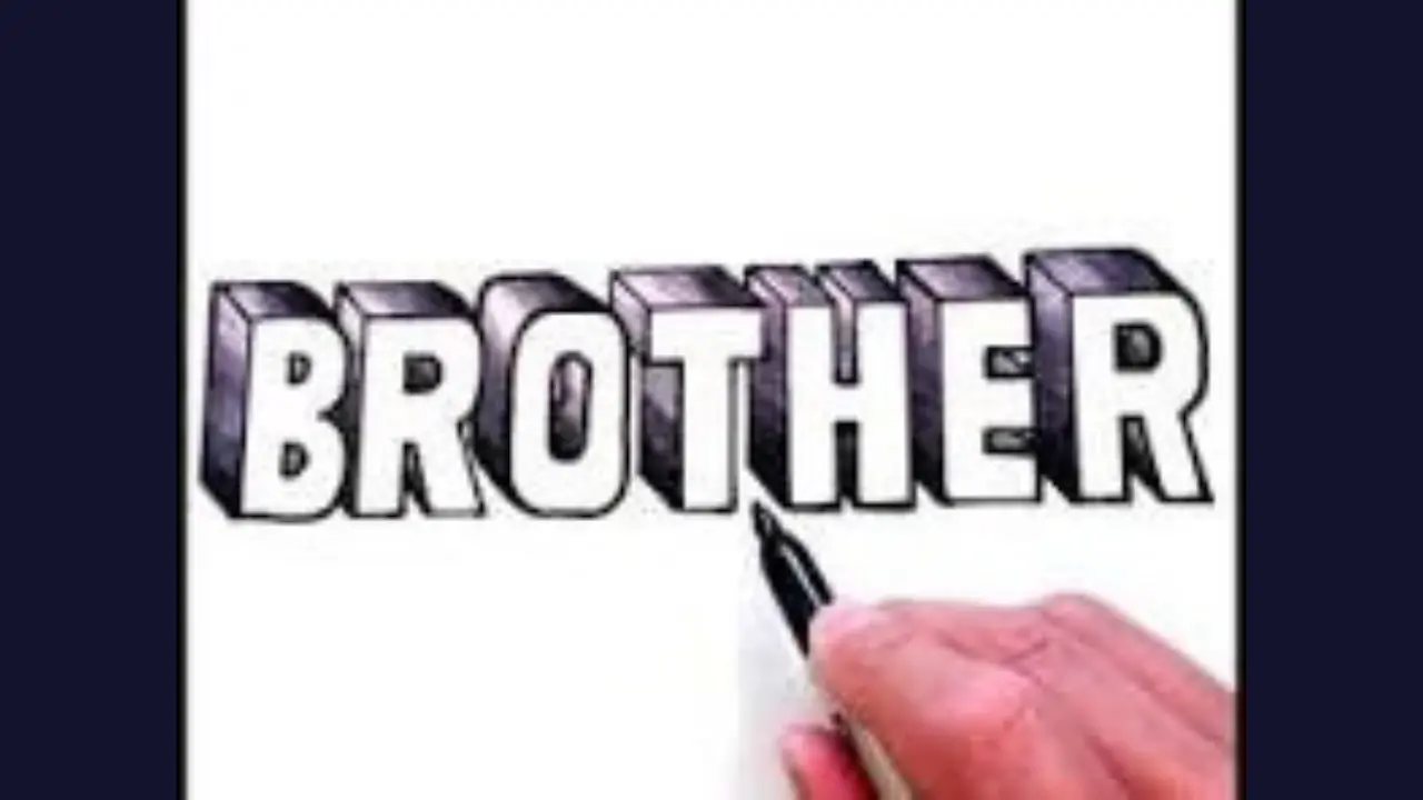
Brother in Bubble Letters Draw, Color, and Style It
Brother in bubble letters is a rounded, playful way to write the word “brother” for a card, poster, school project, label, or drawing. The simplest method is to sketch large block letters, round off the sharp corners, add an outline, and color the letters. Keep each character wide enough to look puffy while leaving small, even gaps between them.
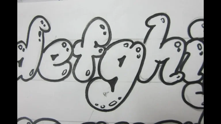
A bubble-letter design does not need to follow one exact font. What makes it work is the soft, inflated shape: thick strokes, curved edges, open spaces inside letters, and an outline that makes the word easy to read.
Quick bubble-letter layout for “Brother”
Start by writing the word in uppercase: B R O T H E R. Uppercase letters are usually easier to turn into bubbles because their height and spacing are more consistent.
Use this as a planning guide rather than a finished font:
| Letter | Bubble-letter shape to aim for |
|---|---|
| B | A tall rounded outer shape with two large, soft loops. |
| R | A rounded bowl at the top, followed by a thick diagonal leg. |
| O | A wide oval or circle with a smaller oval opening in the center. |
| T | A broad, pill-shaped top bar and a thick vertical stem. |
| H | Two rounded vertical pillars joined by a soft middle bar. |
| E | A thick curved spine with three short, rounded arms. |
| R | Repeat the rounded R shape to finish the word. |
For a friendlier look, make the O slightly larger than the other letters and gently tilt a few letters. For a neat sign or heading, keep every letter on the same baseline and use similar widths.
Cute Bubble Letters Easy Step-by-Step Guide for Beginners
How to draw “Brother” in bubble letters
Draw lightly in pencil first. This gives you room to adjust the shapes before committing to a darker outline.
- Mark the word’s width. Draw a faint horizontal guide line at the bottom and another near the top. Seven large letters need more room than ordinary handwriting, especially the B, O, and R.
- Write a basic block-letter version. Use simple capital letters. Leave a narrow gap between each one so the outlines will not run together.
- Round the corners. Replace pointed corners with curves. A T should have rounded ends; the corners of an E should bend softly rather than form sharp angles.
- Thicken the strokes. Draw a second line around each letter to create a wide, inflated body. Keep the thickness fairly even throughout the word.
- Refine the inner spaces. The openings inside B, O, and R are called counters. Keep them large enough that the letters remain clear after coloring.
- Trace the final outline. Once the word looks balanced, trace the best lines with a marker, pen, or darker pencil. Erase the construction lines after the ink is dry.
- Add color and details. Fill each letter, add highlights, or draw a drop shadow. Small decorative marks around the word can complete the design.
Make the letters look soft and puffy
Bubble lettering is easier to recognize when the outlines are smooth and the stroke width stays consistent. Avoid making every letter perfectly circular; the goal is a rounded version of a readable letter, not a row of balloons.
Use a double outline
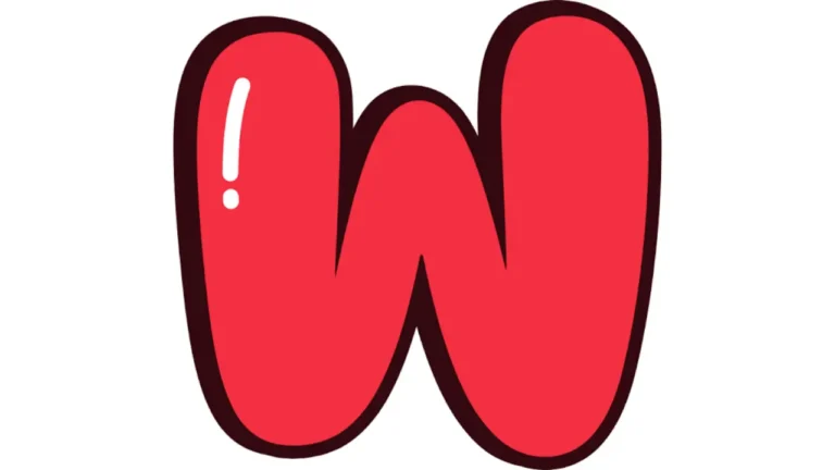
A thin inner outline or a second outline outside the letters can make the word stand out. Leave a small strip of white paper between the letter fill and the outer outline for a sticker-like effect.
Add a highlight
Place a small white oval, curved line, or dot near the upper-left area of each letter. Keep the highlights in the same general direction so they look like reflected light. A highlight works especially well on B, O, and R because their broad curves give it space.
Add a simple shadow
Draw a second copy of the outline slightly down and to the right, then connect it to the main letter edges. Color that narrow offset area a darker shade. This creates a basic 3D effect without making the word hard to read.
Alphabet Bubble Letters Easy Steps, Styles & Tips for Beginners
Color ideas for brother in bubble letters
Choose colors based on where the design will appear. High contrast matters more than using many colors: a dark outline around a light fill, or a light outline around a dark fill, keeps the word readable from a distance.
- Classic cartoon: Blue letters, dark navy outline, and white highlights.
- Rainbow: Give each letter a different color, then use one outline color around all of them.
- Two-tone gradient: Use a lighter shade at the top and a darker shade at the bottom of each letter.
- Sports-style: Use two team-like colors with a bold black or dark outline.
- Soft pastel: Use light pink, mint, lavender, yellow, or sky blue with a medium-gray outline.
- Monochrome: Use one color in several shades. This gives a clean look for a notebook cover or room sign.
If you use markers, test the colors on a separate sheet first. Some colors can bleed through thin paper or become much darker where strokes overlap.
Decorations that fit the word “Brother”
Small details can make the lettering feel personal without crowding it. Choose two or three decorative elements, not every option at once.
- Stars, lightning bolts, or small dots around the outside of the word
- A crown above the B or O
- A banner behind the letters
- A small heart between or beneath letters for a sibling card
- Comic-style action lines extending from the word
- A name, nickname, or short message underneath in plain handwriting
- A border made from stripes, checker squares, clouds, or tiny circles
For a birthday card, place the word at the center and add the recipient’s name below it. For a poster, make “BROTHER” the main heading and reserve the surrounding space for photos, memories, or a message.
Common mistakes and easy fixes
Most bubble-letter problems come from spacing or overly detailed shapes. Fix them at the pencil stage before adding color.
| Problem | How to fix it |
|---|---|
| Letters touch after outlining | Start with larger gaps between the plain block letters, or make the outline thinner. |
| The word is difficult to read | Make the inner openings in B, O, and R larger and simplify unusual curves. |
| Some letters look much heavier | Check that the inflated border has a similar thickness around each letter. |
| The design feels flat | Add one highlight and a narrow shadow, keeping both in a consistent direction. |
| The page feels crowded | Make the word slightly smaller or remove extra decorations around it. |
Digital options for a clean result
You can also make rounded lettering digitally with a drawing app, presentation program, word processor, or online design tool. Look for a thick rounded display font, then increase the outline or stroke around the text. A shadow, gradient fill, and white highlight shapes can recreate a hand-drawn bubble effect.
For a printable design, use a large font size, leave generous margins, and print a test page before using expensive paper. If the lettering is for children to color, use only a bold outline and leave the interiors blank.
Frequently Asked Questions
Should “brother” be written in upper- or lowercase bubble letters?
Either works, but uppercase letters are usually easier for beginners. They also create a stronger, more balanced heading. Lowercase lettering can look softer and more casual.
What is the easiest letter in “brother” to draw as a bubble?
The O is usually the easiest because it begins as a simple oval. The B and R take more care because their inner spaces and curved sections must stay clear.
How can I make bubble letters look three-dimensional?
Add a shadow offset slightly down and to one side of every letter. Use a darker shade for that edge and add small white highlights on the opposite upper area.
Can I use bubble letters for a greeting card?
Yes. Large rounded lettering works well for birthday cards, sibling appreciation notes, scrapbook pages, and handmade signs. Use a color scheme and small decorations that suit the occasion.
Do bubble letters need to be perfectly even?
No. A little variation can make hand-drawn lettering feel lively. The word should still have consistent outline thickness, readable letter shapes, and enough space between characters.
A simple finishing approach
For a dependable result, draw “BROTHER” in large block capitals, round each corner, trace a thick outer edge, and add one color scheme with a dark outline. A few highlights or a single drop shadow are enough to make it look finished.
Whether it is part of a card, poster, or coloring page, brother in bubble letters looks best when the word stays easy to read and the decorations support the lettering rather than compete with it.