Sister in Bubble Letters Design, Art, Drawing
Sister in bubble letters is a playful hand-lettering style for cards, posters, notebook covers, wall art, and handmade gifts. Bubble letters are large, rounded letters with soft corners and enough open space for color, patterns, or shadows. You can draw the word freehand, trace a lightly written guide word, or build each letter from simple rounded shapes.
How to write sister in bubble letters
Write the word in large lowercase or uppercase letters, then turn each letter into a thick, rounded outline. Keep the spaces inside letters such as s, e, and r open enough to read after you add color.
- Choose your style. Use all capitals for a bold sign—SISTER—or lowercase for a softer look—sister. Pick one style before drawing.
- Make a light pencil guide. Draw two faint horizontal lines to set the top and bottom of the letters. Lightly write the word in ordinary handwriting between them.
- Widen each letter. Draw a second line around the outside of each guide letter. Round the corners and curves instead of making sharp angles.
- Leave even gaps. Keep a small amount of white space between letters. If they touch, the word can become difficult to read once it is colored.
- Erase the inner guide. When the outer letter shapes look right, carefully erase the thin original writing.
- Trace and decorate. Use a marker, colored pencil, or pen to finish the outline. Add color, a shadow, or patterns after the ink is dry.
If freehand lettering feels hard, write the word once in large block writing and trace around it. This simple method gives you a reliable starting shape without needing a special font.
Simple letter-by-letter shape tips
The word has six letters, and each one needs a slightly different approach. Work slowly on the first draft; bubble lettering becomes easier once you see how the shapes relate to one another.
S
Make the S wide rather than narrow. Use two gentle, rounded bends—one at the top and one at the bottom. A narrow S can look cramped after you thicken it, so leave room around the middle curve.
I
A capital I can be a simple tall, rounded rectangle. For a more decorative version, add short rounded bars at the top and bottom. A lowercase i can have a circle or heart-shaped dot, but keep the dot separated from the stem.
S
Repeat the first S with the same height and thickness. Matching the two S letters makes the whole word feel balanced. It is fine if they are not identical; hand-drawn lettering often looks best with small natural differences.
T
Give the top bar of the T rounded ends and make it wider than the vertical stem. Place the stem near the center. A very thin stem may disappear visually beside wider letters.
E
Start with a rounded vertical spine, then add three horizontal arms. Keep the middle arm shorter than the top and bottom arms so the E remains easy to recognize. Slightly curve the arm ends to match the rest of the word.
R
Draw the R as a rounded vertical stem with a bubble-like upper loop. Let the diagonal leg extend outward gently. Avoid making the leg too thin or too sharp, especially if the other letters are soft and puffy.
Cute Bubble Letters Easy Step-by-Step Guide for Beginners
Choose a layout before you decorate
Letter placement changes the mood of the design. A single straight line works well for labels and banners, while a curved or stacked layout suits cards and artwork.
| Layout | Best for | Helpful tip |
|---|---|---|
| SISTER on one line | Posters, notebook covers, name signs | Use a ruler or guide lines to keep the baseline steady. |
| sis / ter stacked | Small cards and square drawings | Center both rows before tracing the outline. |
| Letters on a curve | Gift tags and framed art | Sketch a light arc first, then place letters along it. |
| Mixed-size letters | Fun, casual designs | Keep similar outline thickness so the word still feels connected. |
For a birthday card or a gift for a sibling, a gentle upward curve can make the word feel cheerful. For a clean room sign, evenly sized letters on a straight baseline are usually easier to read.
Color and decoration ideas
Once the outline is complete, the open centers of bubble letters offer many ways to personalize the design. Use two or three main colors if you want a coordinated look; using too many colors can hide the letter shapes.
- Solid color: Fill each letter with one color and use a darker outline.
- Rainbow letters: Give every letter a different color, or blend colors across the word.
- Polka dots: Fill the letters with a base color, then add dots in a contrasting shade.
- Stripes: Draw horizontal, diagonal, or wavy stripes inside each letter.
- Hearts, stars, or flowers: Add small repeated shapes inside the letters or around the word.
- Animal print: Use spots, simple tiger-like stripes, or tiny paw prints for a themed design.
- Glitter effect: Add small white dots and short shine marks over darker colors. Actual glitter can be fun, but it may make writing harder to read.
A white gel pen can create highlights after colored marker or pencil has dried. Small curved white marks near one side of a letter can make it appear shiny and rounded.
Alphabet Bubble Letters Easy Steps, Styles & Tips for Beginners
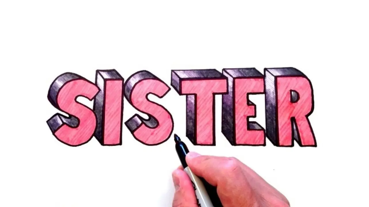
Add a shadow for a 3D bubble-letter effect
A drop shadow makes the letters look as if they are raised above the page. The easiest method is to repeat part of the outline slightly down and to the right, then connect the matching edges.
- Finish the main letter outline first.
- Choose one shadow direction, such as down-right.
- Draw a second, partial outline a short distance from the original letters in that direction.
- Connect the outer edges with short lines.
- Fill the new side area with a darker shade of the main color or a neutral gray.
Use the same direction for every letter. Shadows pointing in different directions can make the word look uneven. For a lighter effect, skip the connected side and draw a thin gray or colored offset outline instead.
Make the lettering neat and readable
Bubble letters can become messy when the shapes are too crowded. A few small choices keep your word clear, even with detailed decoration.
- Keep the letter thickness similar from start to finish.
- Make the two S letters roughly the same width and height.
- Leave open spaces inside and around letters instead of coloring every area.
- Use a darker outline than the fill color for contrast.
- Check the word from arm’s length before adding tiny details.
- Erase pencil marks gently so the paper does not smudge or tear.
If a letter looks too narrow, do not try to squeeze in more decoration. Widen its outer outline or reduce the amount of fill pattern. Readability matters more than making every area busy.
Ideas for using your finished design
Bubble-letter art works best when it feels personal. The word can stand alone, or it can be part of a message such as “Best Sister,” “Big Sister,” or “Little Sister.”
- Create the front of a birthday, thank-you, or encouragement card.
- Use it as a heading on a scrapbook or photo page.
- Make a handmade bookmark with a clear protective cover or laminated finish.
- Add it to a school project, journal page, or pencil case label.
- Draw a small poster or door sign with favorite colors and symbols.
- Use it as a practice word for learning basic bubble-letter shapes.
For a gift design, consider the recipient’s favorite colors, hobbies, or interests. For example, music notes, flowers, sports motifs, or tiny book shapes can frame the word without covering it.
Common mistakes and easy fixes
Letters overlap: Redraw the outer edges with more space between them. A thin gap can make a big difference.
The word is hard to read: Simplify the patterns, darken the outline, and make sure the openings in letters stay visible.
Some letters look flat while others look puffy: Round sharp corners and use a similar outline width throughout the word.
The design leans or drifts: Start with faint guide lines. A ruler is useful for a straight layout, while a lightly drawn arc helps with curved words.
Marker bleeds through the paper: Put scrap paper underneath, use a thicker sheet, or color with pencils or crayons instead.
Frequently asked questions
Can I draw sister in bubble letters without a stencil?
Yes. Lightly write the word in regular handwriting, then draw a wider rounded outline around each letter. Erasing the original guide after tracing creates a clean bubble-letter look.
Should bubble letters be uppercase or lowercase?
Either works. Uppercase letters often look bold and simple, while lowercase letters can look softer and more playful. Choose the form that fits the available space and your design style.
What is the easiest material for beginners?
Pencil and eraser are the easiest starting tools because you can adjust the shapes. Colored pencils are also forgiving because they make it easy to layer shades and add soft details.
How can I make the letters look more like bubbles?
Use rounded corners, thick outlines, bright fills, and small white highlights. An offset shadow or darker edge also gives the letters more depth.
Can the letters touch each other?
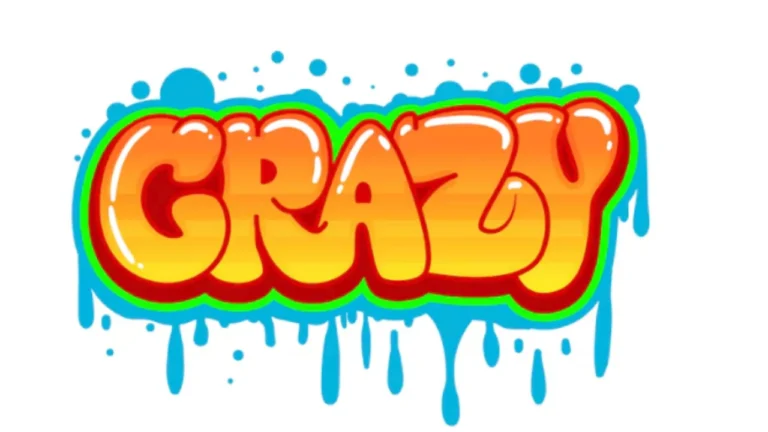
They can, especially in a graffiti-inspired style, but leaving a small gap is better for beginners. Separate letters are easier to outline, color, and read.
A simple final approach
Start with light guides, make each letter wide and rounded, then add only as much color and decoration as the word can comfortably hold. Whether it is part of a card, a poster, or a doodle, sister in bubble letters looks best when the shapes are clear and the details reflect the person or occasion you have in mind.