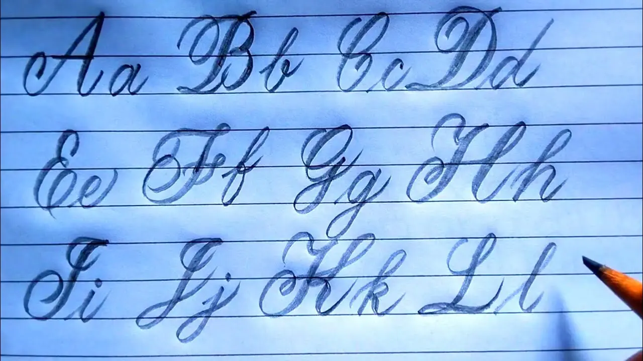
Script Alphabet Letters Tradition, Region, School Method, Font
Script alphabet letters are letterforms written with flowing strokes, often with letters joined together. In English, “script” commonly means cursive handwriting: a style that differs from separate printed or block letters. A script alphabet includes both uppercase and lowercase forms, but its appearance can vary by handwriting tradition, region, school method, font, and individual writer.
Learning to recognize script letters helps with handwriting, reading old notes and documents, signing a name, and understanding cursive fonts. The key is to learn each letter’s basic shape before trying to write quickly or connect whole words.
What are script alphabet letters?
Script alphabet letters are alphabet characters made with continuous, curved, or looped pen movements. In cursive writing, many lowercase letters connect along a shared baseline, allowing a word to be written with fewer pen lifts than print writing.
“Script” can also describe a typeface designed to resemble handwriting. A script font may be formal and decorative, while everyday cursive handwriting is usually simpler and more personal. They are related styles, but they are not always easy to read in the same way.
| Writing style | Typical appearance | How letters relate |
|---|---|---|
| Print or block letters | Separate, upright shapes | Usually written one letter at a time |
| Cursive script | Flowing, looped, or slanted shapes | Many letters join within a word |
| Decorative script font | Stylized handwriting-like design | May connect, but can prioritize appearance over easy reading |
The English cursive alphabet
The English alphabet has 26 letters, and cursive represents the same sounds and letters as print. What changes is the form. Lowercase cursive letters are commonly taught first because they appear more often in ordinary words and usually connect more naturally.
Lowercase cursive letter families
Rather than memorizing 26 unrelated shapes, many learners find it easier to group letters by their first stroke or overall movement. Exact forms differ between teaching systems, but these broad families are useful.
- Curve-based letters: a, c, d, g, o, q
- Loop or tall-stroke letters: b, e, f, h, k, l
- Hump-based letters: i, m, n, r, t, u, w
- Descending letters: f, g, j, p, q, y, z
- Distinct forms: s, v, x
These groups are only a learning aid. For example, cursive r, s, and z often have noticeably different forms depending on the handwriting model being used.
Cute Bubble Letters Easy Step-by-Step Guide for Beginners
Uppercase cursive letters
Capital script letters begin sentences and are used for proper names, titles, and initials, just as capital print letters are. They tend to vary more than lowercase cursive. A capital Q, G, F, I, J, T, and Z may look especially different across workbooks, family handwriting, and historical styles.
Because capitals usually occur at the start of a word, they do not always need to connect to the next letter. A clear, readable capital is more useful than an elaborate one. For a signature, consistency matters more than copying a particular textbook form.
How cursive letters connect
Most cursive writing works through entry strokes and exit strokes. An entry stroke leads into a letter from the baseline; an exit stroke leaves it and can lead into the next letter. The writer keeps the letters close enough for the strokes to meet without making the word crowded.
Not every letter must connect. Writers may lift the pen after a capital, before an awkward combination, or to make a word clearer. The dots on i and j and the crossbar on t are normally added after forming the main strokes.
Alphabet Bubble Letters Easy Steps, Styles & Tips for Beginners
Common connections include an, ch, in, th, and er. Practice these as small units rather than as full sentences at first. Once the hand learns the transition, the connection becomes more natural.
How to write script alphabet letters clearly
Clear cursive comes from controlled movement and steady spacing, not from speed. Start with a simple alphabet model and keep using that same model while practicing. Switching among several different letter styles can make the shapes harder to remember.
- Use ruled paper. The baseline helps keep letters even. If available, paper with a middle guide and upper guide makes tall and descending strokes easier to control.
- Practice the basic stroke patterns. Draw gentle undercurves, ovals, upward loops, and downward loops before making letters.
- Learn lowercase letters one family at a time. Write a few careful rows, then form short letter pairs such as ai, on, or th.
- Add short words. Choose familiar words with simple connections, such as “cat,” “time,” “hand,” or “yellow.”
- Practice capitals separately. Write each capital beside its lowercase partner, then use it in a name or a sentence opening.
- Slow down before increasing speed. Smooth, legible strokes matter more than finishing a page quickly.
A relaxed grip helps. Holding the pen too tightly can make curves shaky and tiring. Slight slant is common in cursive, but a perfectly uniform slant is not required for readable handwriting.
Reading script letters when the writing is hard to decipher
Reading cursive is often easier when you identify the word pattern before trying to name every stroke. Look for tall ascenders, low descenders, dots, crossbars, and repeated letter shapes. Context from the surrounding sentence can also narrow down possible words.
Some cursive letters are commonly confused because their shapes overlap:
- n, m, u, and w: Compare the number and width of humps.
- e, l, and b: Check the height of the loop and whether the stroke rises above the middle of the writing.
- r, s, and z: These have highly variable cursive forms, especially in older handwriting.
- g, j, p, q, and y: Look below the baseline for the descending stroke.
- capital I, J, and T: Examine nearby words and the writer’s repeated capital forms.
Do not assume every flourish is a separate letter. A long stroke may simply be a connection or an ending stroke. When reading a historical document, spelling, abbreviations, ink quality, and the writer’s personal style can add another layer of difficulty.
Script, cursive, calligraphy, and handwriting fonts
These terms are often used loosely, but they describe different things. Understanding the difference can help when choosing a learning resource or a typeface.
| Term | Meaning | Main purpose |
|---|---|---|
| Script | A broad term for handwriting-like letterforms; in many school contexts, cursive writing | Writing style or visual form |
| Cursive | Handwriting in which letters are often joined | Fast, flowing handwritten text |
| Calligraphy | Deliberate artistic lettering made with attention to stroke shape and composition | Decorative or formal lettering |
| Script font | A digital typeface that imitates handwriting or calligraphy | Typography and design |
A calligraphy alphabet can use script-like forms, but it is not automatically the same as everyday cursive. Calligraphy often uses specialized tools and planned variations in line thickness. Cursive can be written with an ordinary pen and is usually intended for practical communication.
Why script forms vary
There is no single universal cursive shape for every English letter. Schools have used different handwriting systems, and people gradually develop personal habits. A letter may become narrower, rounder, more slanted, or less connected over time while remaining recognizable.
Older manuscripts and formal handwriting can be even more variable. Terms such as italic, round hand, Spencerian, and Copperplate refer to distinct historical or calligraphic traditions with their own conventions. They should not be treated as interchangeable with a modern classroom cursive alphabet.
For everyday use, legibility is the best standard. A reader should be able to distinguish letters without guessing, and words should have enough space between them. Decorative loops are optional.
Common mistakes when learning cursive
- Trying to connect every stroke: Forced joins can make words less readable. Lift the pen when needed.
- Making all letters the same height: Tall letters, middle-height letters, and descending letters need different proportions.
- Ignoring spacing: Spaces between words should be visibly wider than spaces inside a word.
- Practicing only the alphabet: Letters also need practice in pairs and real words.
- Copying decorative fonts: Many script fonts are poor models for beginner handwriting because their flourishes are not practical.
Frequently asked questions
Are script letters and cursive letters the same?
In many everyday contexts, yes: “script” refers to cursive handwriting. More broadly, script can include other handwriting-inspired forms, including decorative typefaces and calligraphic styles.
Do all cursive letters have to connect?
No. Connecting letters is a common feature of cursive, not an absolute rule. Pen lifts can improve comfort and readability.
Why do cursive capital letters look different from print capitals?
They developed from flowing handwriting movements rather than from separate block shapes. Capitals also vary more across handwriting systems, so more than one form may be accepted.
What is the easiest way to memorize the cursive alphabet?
Learn a consistent model, group lowercase letters by similar strokes, and practice short combinations before moving to words. Frequent brief practice is usually more effective than occasional long sessions.
Can a signature be written differently from standard cursive?
Yes. A signature is often personalized and may be partly printed, partly cursive, or highly stylized. It should still be used consistently where a signature is required.
Making script writing useful
Script alphabet letters are not a separate alphabet; they are a flowing way of forming the familiar letters A through Z. Focus first on recognizable lowercase shapes, then practice joins, capitals, and short words. Whether the goal is reading a handwritten card, improving penmanship, or creating a personal signature, clear and consistent cursive is more valuable than ornate writing.