Bubble Letters O Easy Ways To Draw, Style
Learning how to create bubble letters o is a fun way to improve hand lettering and creative drawing skills. The letter O is one of the easiest bubble letters to practice because its basic shape is round and simple.
Artists, students, teachers, and designers often use bubble lettering for posters, notebooks, greeting cards, and digital artwork. With a few basic techniques, you can turn a normal letter O into a bold, colorful, and attractive design.
What Are Bubble Letters?
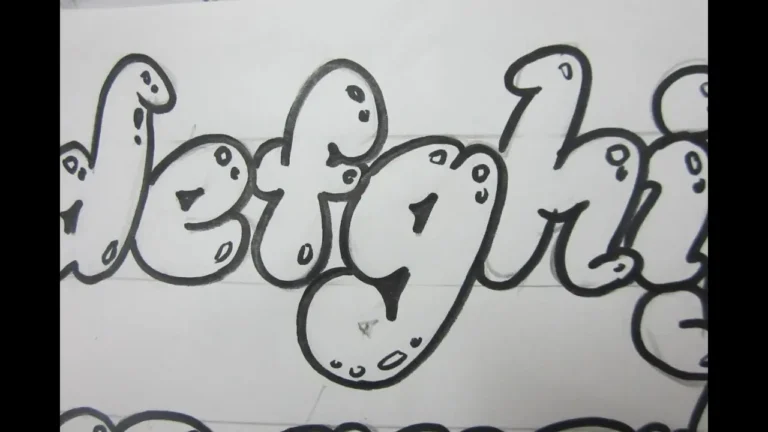
Bubble letters are large, rounded letters that look soft, thick, and inflated. Instead of using thin straight lines, artists create wide outlines around each letter to give it a playful appearance.
The bubble letters o style works especially well because the natural shape of O already looks like a circle or oval. You only need to make the outline thicker and adjust the inner space to create a classic bubble effect.
Bubble lettering became popular in graffiti, school projects, cartoons, and decorative art. Today, people also use these letters in digital graphics, social media designs, logos, and printable worksheets.
How to Draw Bubble Letters O Step by Step
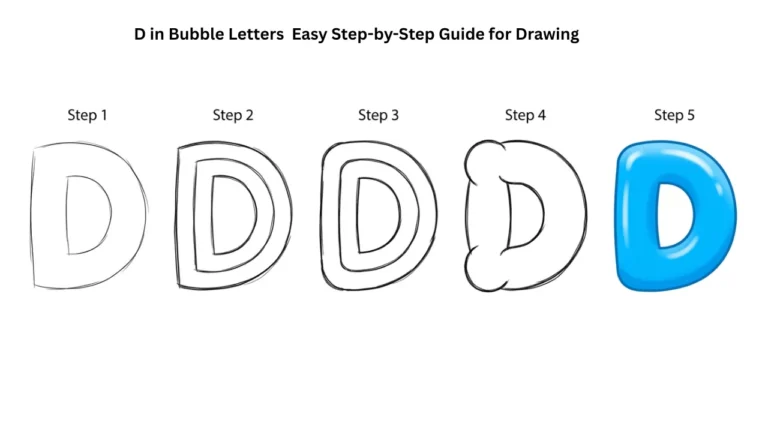
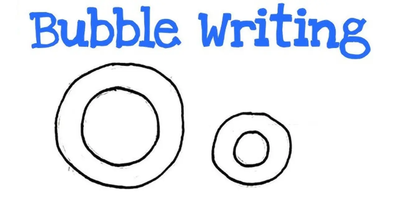
Drawing bubble letters o does not require advanced art skills. Start by lightly drawing a large oval or circular shape with a pencil.
Next, draw another smaller oval inside the first shape. This smaller shape creates the empty center of the letter O.
Make sure the distance between the outer and inner lines stays fairly even. This gives the letter a smooth and balanced appearance.
Once you like the shape, trace the outer and inner lines with a darker pencil, marker, or pen. Erase any unwanted guidelines after the ink dries.
You can then add colors, shadows, highlights, or patterns to make the letter more interesting.
Cute Bubble Letters Easy Step-by-Step Guide for Beginners
Different Styles of Bubble Letters O
There is no single way to design bubble letters o. You can change the shape, thickness, color, and decoration depending on your project.
A simple rounded O works well for beginners. You can create it by drawing two smooth oval shapes and keeping the borders thick.
For a graffiti-style O, make the outline wider and less symmetrical. You can also add sharp extensions, shadows, or overlapping shapes.
Another option is a cartoon bubble O. Add eyes, a smile, hands, or other features to turn the letter into a character.
You can also create a 3D version by adding a second outline behind the main letter. Connect the edges with small lines to create the appearance of depth.
How to Add a 3D Effect
A 3D effect can make bubble letters o stand out from the page. First, draw your normal bubble O.
Then draw another similar outline slightly below and to one side of the original letter. Connect matching areas of both shapes with short lines.
Shade the side or lower sections to create depth. Keep the front part lighter so viewers can easily see which side faces forward.
For an even stronger effect, add a small shadow behind the letter. A shadow makes the O appear as if it is floating above the background.
Alphabet Bubble Letters Easy Steps, Styles & Tips for Beginners
Adding Colors and Patterns
Color can completely change the appearance of a bubble letter. Bright colors often create a cheerful and playful design, while darker colors can create a bold graffiti look.
You can fill bubble letters o with one solid color for a clean style. You can also use two or more colors to create gradients.
Patterns provide another creative option. Try adding dots, stars, stripes, hearts, waves, flames, or small geometric shapes inside the letter.
A popular technique involves using a dark outline and a lighter color inside. This contrast helps the letter remain easy to read.
For digital designs, you can also add textures, glowing effects, or metallic styles.
How to Draw a Lowercase Bubble Letter O
A lowercase O looks similar to an uppercase O, which makes it easy for beginners to practice. The main difference usually comes from size and how the letter fits beside other lowercase characters.
Start with a small rounded oval. Add another oval inside it while keeping enough space between the two lines.
You can make lowercase bubble letters o wider, taller, or slightly tilted depending on the lettering style you want.
When creating a full word, keep the thickness of each letter consistent. This creates a cleaner and more professional appearance.
Common Mistakes When Drawing Bubble Letters
One common mistake involves making the inner circle too large. If the center opening becomes too wide, the letter may look thin instead of bubbly.
Another mistake is using uneven outlines. One side of the O may become much thicker than the other side.
Try to maintain similar spacing between the outer and inner shapes. However, perfect symmetry is not always necessary, especially when creating graffiti or hand-drawn styles.
Artists should also avoid pressing too hard with a pencil during the first sketch. Light guidelines are easier to erase after finishing the final outline.
Creative Uses for Bubble Letters O
You can use bubble letters o in many creative projects. Students often add bubble lettering to school posters, project covers, and classroom displays.
Teachers may use large bubble letters for alphabet worksheets and educational activities. Children can color the letters while learning different alphabet shapes.
Artists can include bubble O designs in graffiti-style artwork, doodles, journals, and sketchbooks. Digital creators can also use them in thumbnails, stickers, social media posts, and printable graphics.
Bubble letters also work well for birthday cards, banners, room decorations, and personalized name designs.
Tips for Making Bubble Letters Look Better
Practice is the easiest way to improve bubble lettering. Draw the same letter several times while testing different shapes and sizes.
Use a pencil before working with permanent markers. This allows you to correct the shape without restarting your entire design.
You can also study different fonts and lettering styles for inspiration. Notice how artists change curves, outlines, shadows, and spacing.
Adding small white highlights can make the letter look shiny and inflated. Draw a short curved white line near the upper edge to create this effect.
Keeping your outlines smooth is also important. Slow, controlled movements usually create cleaner curves than quick strokes.
Bubble Letters O for Beginners
Beginners should start with basic rounded designs before trying complicated effects. A simple O only requires an outer circle and a smaller inner circle.
After mastering this shape, experiment with thicker edges, tilted letters, shadows, and decorations. Each variation helps develop better control and creativity.
Using tracing paper can also help beginners understand letter proportions. Trace a few examples and then try drawing the same style without assistance.
Over time, you can develop your own lettering style instead of copying existing designs.
Final Thoughts
Creating bubble letters o is a simple and enjoyable way to explore decorative lettering. Its naturally round shape makes the letter O an excellent starting point for beginners who want to learn bubble writing.
You can keep the design simple or add colors, patterns, highlights, shadows, and 3D effects. With regular practice and creative experimentation, a basic letter O can become an eye-catching piece of artwork.