Bubble Letters Lowercase Alphabet Styles, Tips And Ideas
Bubble letters lowercase are a fun and creative way to turn normal letters into soft, rounded, eye-catching designs. People often use this lettering style for school projects, posters, notebooks, greeting cards, artwork, and social media designs. Unlike standard handwriting, bubble letters give each character a thick and playful appearance that makes words stand out.
Learning this style does not require advanced drawing skills. You only need a pencil, paper, eraser, and some patience. Once you understand the basic shapes, you can create an entire lowercase alphabet and customize it with colors, shadows, patterns, or other decorative effects.
What Are Bubble Letters Lowercase?
Bubble letters lowercase are small alphabet letters drawn with thick, rounded outlines instead of thin handwriting strokes. The letters look inflated, almost like balloons or bubbles.
Lowercase bubble lettering usually feels softer and more casual than uppercase lettering. Letters such as a, c, e, m, and s naturally contain curves, which makes them especially suitable for this style.
Artists can make these letters simple or highly decorative. Beginners may use plain outlines, while experienced artists can add highlights, shadows, gradients, textures, and detailed patterns.
Cute Bubble Letters Easy Step-by-Step Guide for Beginners
Why Are Lowercase Bubble Letters Popular?
Bubble lettering remains popular because it combines writing and drawing. It allows people to express their creativity without needing complicated art techniques.
Students often use bubble letters when designing project headings, classroom posters, and notebook covers. Artists may use them for illustrations, handmade cards, journals, and digital artwork.
The rounded shapes also make words easier to notice. A simple title can become much more attractive when someone writes it using bubble letters lowercase instead of ordinary handwriting.
This lettering style also offers plenty of freedom. There is no single correct shape for every letter. You can make your letters wide, narrow, tall, short, simple, or decorative.
How to Draw Lowercase Bubble Letters
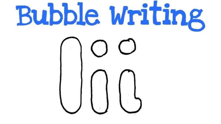
Start by writing a lowercase letter lightly with a pencil. Make the letter slightly larger than your normal handwriting so you have enough space to create the bubble shape.
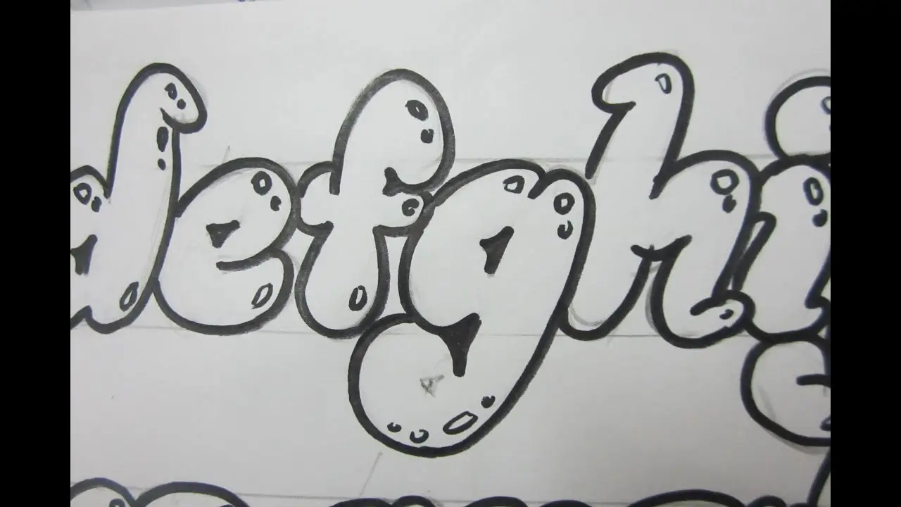
Next, draw a rounded outline around the original letter. Keep some distance between the pencil line and the outline. Avoid sharp corners because smooth curves create the classic bubble effect.
After creating the outline, erase the original letter inside it. You should now have a thick, hollow bubble-shaped character.
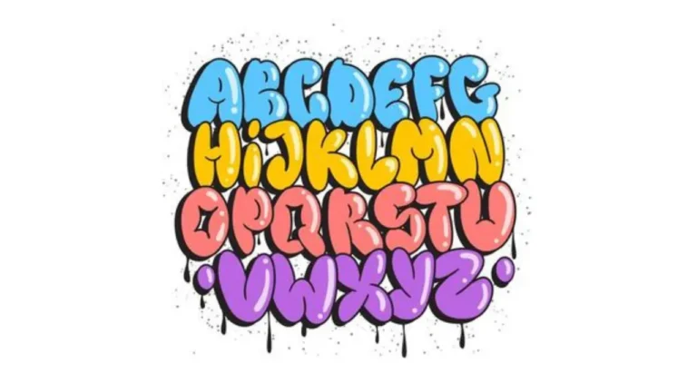
Repeat this process when practicing bubble letters lowercase from a to z. Working through the complete alphabet helps you understand how straight, curved, tall, and descending letters behave differently.
Alphabet Bubble Letters Easy Steps, Styles & Tips for Beginners
Easy Lowercase Letters for Beginners
Some letters are easier to draw than others. Rounded characters such as a, c, e, o, and s are good starting points because their natural shapes already match the bubble style.
Letters such as l, i, and t are also fairly simple. You only need to make their narrow strokes thicker and softer.
Letters like g, k, m, r, and y may require more practice. They contain extra curves, joins, or descending strokes that can become crowded when you make them thicker.
The table below shows a simple practice approach.
| Letter Type | Examples | Difficulty |
|---|---|---|
| Rounded letters | a, c, e, o, s | Easy |
| Straight letters | i, l, t | Easy |
| Mixed shapes | b, d, h, p | Medium |
| Detailed letters | g, k, m, r, y | Medium |
| Wide letters | m, w | Medium |
Practice the easy letters first before moving toward more complicated shapes.
How to Make Bubble Letters Look Better
Once you understand the basic alphabet, you can start improving your designs. Consistent spacing makes a major difference. Try to keep similar spaces between letters so that your word looks balanced.
You should also keep the thickness of each letter fairly consistent. If one side appears extremely thick while another looks too thin, the design may feel uneven.
Adding shadows can give bubble letters lowercase a three-dimensional appearance. Draw a second line slightly below or beside each letter to create the impression that light comes from one direction.
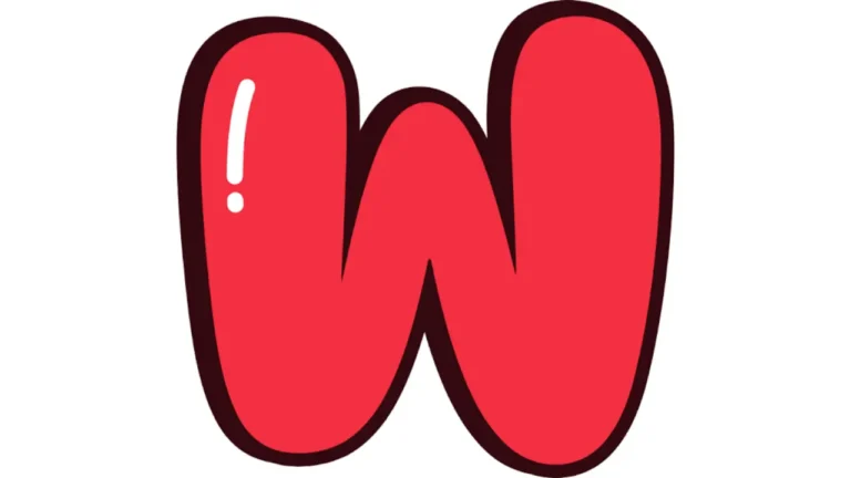
Highlights can produce an even stronger bubble effect. Add a small white oval or curved line near the top of each letter after coloring it.
Creative Ways to Decorate Bubble Letters
Color can completely change the mood of bubble lettering. Bright colors create cheerful designs, while pastel shades give letters a soft and relaxed appearance.
You can also fill the letters with patterns instead of using one solid color. Popular ideas include stripes, dots, stars, hearts, waves, flowers, checkerboards, and small geometric shapes.
Another option involves using different colors for individual letters. This technique works especially well for names, birthday signs, classroom displays, and children’s artwork.
When designing bubble letters lowercase, avoid adding too many details at once. A simple design with clear outlines often looks better than a crowded letter filled with several unrelated patterns.
Bubble Letters for School and Art Projects
Bubble lettering works well for many creative activities. Students can use it to create headings for science projects, art assignments, book reports, posters, and presentation boards.
Teachers may also use bubble lettering for classroom decorations, labels, activity sheets, or alphabet displays.
Outside school, people can add these letters to scrapbooks, journals, birthday cards, banners, handmade gifts, and wall art.
Digital designers can recreate the same style with drawing apps and design software. Digital tools make it easy to experiment with colors, outlines, shadows, and textures without starting the entire design again.
Common Mistakes to Avoid
One common mistake involves drawing letters too close together. Thick outlines require more space than normal handwriting, so leave enough room between each character.
Another mistake involves making sharp corners. Bubble lettering should usually have smooth and rounded edges. Soft curves create the inflated appearance that defines the style.
Beginners may also press the pencil too hard during the first sketch. Use light pencil marks because you will need to erase the original guide after completing the outline.
When practicing bubble letters lowercase, focus on clean shapes before adding decorative elements. Strong basic lettering will make colors, patterns, shadows, and highlights look much better.
Tips for Practicing the Lowercase Alphabet
Regular practice helps improve control and consistency. Instead of drawing random letters every day, practice the alphabet in small groups.
For example, begin with a, b, c, d, and e. Once those shapes feel comfortable, move to the next group. You can later practice complete words and short phrases.
Tracing can also help beginners understand proper proportions. Place thin paper over a bubble-letter alphabet and trace each character before trying to draw it without a guide.
Keep your early drawings instead of throwing them away. Comparing older and newer work can help you see your improvement and identify letters that still need practice.
Using Shadows and 3D Effects
A simple shadow can transform ordinary lettering into a more professional design. First, decide where your imaginary light source will appear.
If light comes from the upper left, place your shadows along the lower and right sides of the letters. Keep the shadow direction consistent throughout the entire word.
You can fill the shadow with a dark color or leave it as an outline. Either method creates more depth and makes the lettering stand out from the background.
Adding small highlights on the opposite side can make the letters appear glossy and inflated.
Final Thoughts
Learning bubble letters lowercase provides an easy and enjoyable way to improve creative lettering skills. Start with simple rounded shapes, maintain consistent spacing, and gradually experiment with colors, patterns, shadows, and highlights.
You do not need professional art tools to begin. A pencil and paper are enough to practice the basic alphabet. With regular practice, bubble letters lowercase can turn ordinary words into attractive designs for posters, cards, notebooks, school projects, and digital artwork.