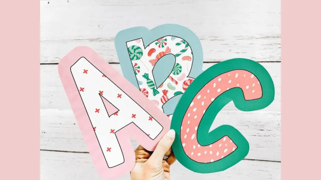
Free Bulletin Board Letters Print, Make, And Use
Free bulletin board letters are printable alphabet sets, reusable cutouts, or simple DIY letters used to create titles, labels, and messages on classroom, office, library, church, or home displays. The best option depends on how often the board changes, how far away readers stand, and whether the letters need to be durable, decorative, or easy for children to read.
A clear display does not require expensive supplies. A well-chosen font, high-contrast colors, and sensible letter size usually matter more than elaborate decorations. Printable templates and basic craft materials can produce polished results with little cost.
Where to get free bulletin board letters
Printable letter templates are widely available through educator resource pages, school and library websites, and design platforms that offer free templates. Many are supplied as individual letter pages or as alphabet sets that can be printed on standard paper.
Before downloading or sharing a file, check its stated use terms. A resource offered at no cost may still limit commercial use, redistribution, or posting the original file online. For a display in your own classroom or community space, choose a template that clearly permits personal or educational use.
You can also make a free set with tools already on a computer. Type each letter in a word-processing or presentation program, enlarge it, and print. This works especially well for short headings because you can control the wording, typeface, size, and color.
Useful places to look
- Teacher and school resource sites with printable alphabet pages
- Public library or school district activity pages
- Free-template areas of design and document-creation tools
- Public-domain image and archive collections, where licensing is clearly stated
- Your own word processor, slide software, or PDF creator
Search by the style you actually need, such as “large outlined alphabet,” “black-and-white block letters,” “uppercase banner letters,” or “editable classroom title letters.” This makes it easier to find letters suited to coloring, cutting, or viewing from a distance.
Cute Bubble Letters Easy Step-by-Step Guide for Beginners
Choose letters for readability first
The most effective bulletin-board lettering can be read quickly from its intended viewing distance. Use simple, bold letterforms for the main message and reserve decorative fonts for a short accent word, if you use them at all.
| Display need | Best lettering choice | Why it helps |
|---|---|---|
| Main title across a room | Large, bold sans-serif or block letters | Thick strokes and open shapes are easier to see. |
| Young readers | Clear print letters with familiar forms | Less visual clutter supports letter recognition. |
| Interactive board pieces | Simple letters on cardstock | They are easier to handle and replace. |
| Seasonal or themed display | Plain letters with a limited decorative border | The theme adds interest without hiding the message. |
| Small labels or captions | High-contrast type in a plain font | Small text stays legible when shapes are uncomplicated. |
Avoid putting patterned letters on a busy background. If both the letters and the board have stripes, dots, or illustrations, the title can disappear. A solid backing shape behind each letter often solves the problem.
How large should bulletin board letters be?
For a title that people should notice from several steps away, print letters as large as the board and phrase allow. Shorter messages can use larger letters, while a long phrase may need a smaller size or a two-line layout.
Test one letter before printing the full set. Tape it to the board, step back to the typical viewing spot, and check whether its shape is easy to recognize. This quick test prevents wasted paper and helps you see whether the contrast is strong enough.
Keep the title brief. A board heading usually works better with a few strong words than with a full sentence. Put explanation, student names, dates, or instructions in smaller supporting text below it.
Alphabet Bubble Letters Easy Steps, Styles & Tips for Beginners
How to print free bulletin board letters at home or school
Most printable sets can be made with ordinary printer paper. Cardstock is a better choice for letters that will remain up for weeks or be reused, but plain paper can still work when mounted on a sturdier backing.
- Pick the phrase. Write it out and count repeated letters before printing.
- Select a clear style. Use a bold, readable font or a ready-made printable alphabet.
- Set the scale. Print a single sample page first. Adjust the size or orientation if needed.
- Print on the right paper. Use paper for temporary displays and cardstock for more durable pieces.
- Cut carefully. Leave a narrow border around outlined letters if cutting directly on the line is difficult.
- Add a backing. Mounting letters on contrasting paper makes them stand out and adds strength.
- Arrange before attaching. Lay the entire title on a table or floor, checking spacing and line breaks.
For multi-page letters, follow the file’s assembly marks if it has them. If it does not, overlap the page edges slightly on the back and tape them together before cutting the letter shape.
Easy ways to make your own letters without a template
DIY letters are useful when you need a custom word, a specific color scheme, or a size that printable pages do not provide. You do not need a cutting machine to make clean-looking letters.
Use a document or slide program
Create a text box for each letter or type the full phrase with extra spacing between characters. Choose a heavy font, enlarge it, and print. Outline-style fonts save ink and can be colored by students, while filled letters create a bolder title.
Trace letters from a screen or book
If printing is not available, place paper over a large letter shown on a screen or use a book cover, poster, or packaging with a clear typeface as a visual reference. Draw the letter shapes onto scrap paper, then use those shapes as tracing patterns for construction paper or cardboard.
Build letters from simple materials
Cardboard from clean boxes, paper grocery bags, magazines, old folders, and leftover wrapping paper can become letter shapes. Cut a plain base first, then cover it with colored paper, paint, fabric scraps, or collage pieces. Keep decorations flat enough that the letters still attach securely to the board.
Make reusable letters last longer
Reusable sets save time for recurring headings, months, names, or classroom routines. Cardstock, laminated paper, foam sheets, or light cardboard are more durable than plain copy paper. Lamination protects against tearing and smudges, though it is not essential for every display.
Store letters by alphabet rather than by phrase. Small envelopes, zipper bags, or labeled folders make it easier to find repeated vowels and common consonants. Keep punctuation, numbers, and blank backing shapes in the same system.
For mounting, choose a method that suits the surface. Removable adhesive dots, poster putty, staples, pins, or loop-and-hook fasteners may work in different settings. Follow the rules for the wall or board, and avoid adhesives that could damage paint or leave residue.
Color and layout ideas that keep the message clear
Choose colors with a visible difference in lightness as well as hue. Dark letters on a light background or light letters on a dark background are often easier to read than colors that are similarly bright. For example, pale yellow letters may fade into a white or light-blue board, even though the colors are different.
- Use one main letter color and one accent color for a calmer look.
- Place a contrasting shadow or mat behind letters that blend into the background.
- Use the same font and size for words that belong together.
- Leave space between letters and around the outside of the title.
- Center a short title, or use a left-aligned layout for longer supporting text.
- Use capitals carefully; mixed case is often easier to read in longer phrases.
Spacing matters as much as color. Letters squeezed together can look like a single shape, while uneven gaps make a title appear accidental. Place the words first, then fine-tune the spacing before permanently attaching anything.
Common mistakes to avoid
Decorative lettering can be appealing, but a bulletin board has a job: readers should understand it quickly. Avoid using several unrelated fonts, overly thin script, low-contrast color combinations, or a title so long that each letter becomes tiny.
Another frequent problem is printing without checking margins. Many home and school printers cannot print to the very edge of a page, so portions of oversized letters may be clipped. A test print helps reveal this. If a letter is cut off, reduce the scale slightly or use a tiled, multi-page design.
Also consider the board’s purpose. A display built for preschool children needs larger, simpler letters than a staff-room announcement. A seasonal board can be playful, but the headline should still be readable before viewers notice the decorations.
Frequently asked questions
Can I use ordinary printer paper for bulletin board letters?
Yes. Printer paper works well for short-term displays. For letters that will be handled often or used again, attach the paper to cardstock or another backing.
What font is easiest to read on a bulletin board?
Large bold block letters and simple sans-serif fonts are usually the clearest choices. Select a typeface with open, familiar letter shapes and avoid ornate scripts for the main heading.
How can I make printed letters stand out?
Mount each letter on a larger contrasting shape, add a simple shadow layer, or place it on a solid background. Strong contrast and adequate spacing are more useful than extra decoration.
How do I save ink when printing large letters?
Choose outline letters, print in black and white, and fill or color the shapes after printing. You can also print one master letter and trace it onto colored paper for repeated characters.
Can children help make bulletin board letters?
Yes. Children can color outlined letters, sort finished pieces, help choose colors, or arrange letters under supervision. Adults should handle cutting tools and mounting methods as appropriate for the group.
Conclusion
Free bulletin board letters work best when they are easy to read, large enough for the space, and matched to the display’s purpose. Start with a short message and a clear font, test one letter at full size, then use contrast and spacing to make the words visible. Whether you print a ready-made alphabet or make your own from paper scraps, thoughtful layout can make a low-cost board feel organized and inviting.