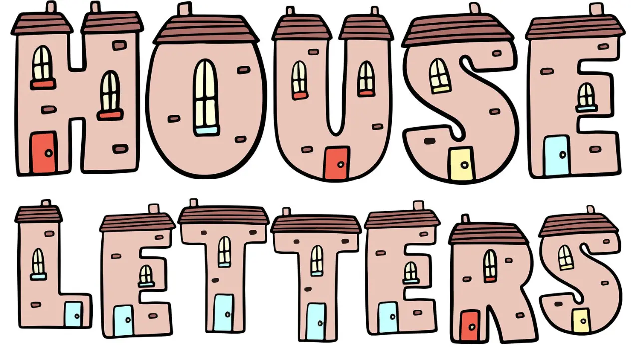
House Letters Choosing, Sizing, and Installing Them
House letters identify a home by its name, street number, or a combination of both. They can be individual characters fixed to a wall, door, gate, mailbox, or plaque. The best choice is easy to read from the street, suits the building’s style, withstands local weather, and is mounted securely without damaging the surface.
They may seem like a small finishing detail, but visible address characters help visitors, delivery drivers, and emergency responders locate a property. Good design is less about choosing the fanciest typeface and more about legibility, contrast, scale, and placement.
What are house letters used for?
House letters are durable alphabetic characters used to display a property name, such as “Rose Cottage” or “The Old Schoolhouse.” They are often used alongside house numbers, particularly where a name is part of the postal address. In some areas, “house letters” is also used broadly for individual address numbers and letters, including flat or unit suffixes such as 12A.
Individual letters create a clean, built-in look because they can be spaced across a wall or mounted onto a signboard. A ready-made plaque is another option when the address needs to include more information or the mounting surface is unsuitable for separate characters.
Start with visibility, not decoration
A house name or number only works when it can be found quickly. Before choosing a material or font, stand at the road or usual approach to the property. Consider where a driver, pedestrian, or visitor first gets a clear view of the entrance.
Place the address where it is unobstructed by hedges, gates, seasonal decorations, parked vehicles, or a porch column. A sign near the door may look attractive but be too far from the street to help someone find the house. For a long driveway, a second marker at the entrance is often more useful than relying only on lettering at the building.
Choose a readable size
Characters need to be larger as viewing distance increases. Small letters may be adequate beside a front door, while an address intended to be read from across a road needs much larger characters. There is no universal size because distance, road width, lighting, eyesight, and contrast all matter.
As a practical check, print the intended name or number at roughly the planned character height, tape it in position, and view it from the relevant distance. If it takes effort to read, choose larger characters or a simpler layout. This low-cost test can prevent an attractive but ineffective installation.
Use simple typefaces
Clean sans-serif and straightforward serif typefaces are usually easiest to read at a distance. Script, highly decorative, very narrow, or overly condensed letters can blur together, especially in low light. Avoid styles that make similar characters hard to distinguish, such as 1 and I, 0 and O, or 5 and S.
For a house name, use capitals and lowercase letters as you normally would for readability. A name set entirely in capital letters may take more space and can be harder to scan when it is long. Keep the layout simple if a number and name appear together.
Materials for house letters
The right material depends on the setting, maintenance expectations, and the surface behind it. Exterior letters must handle moisture, sunlight, temperature changes, and cleaning. The table below outlines common options without assuming that every finish or mounting method is available from every supplier.
| Material | Typical appearance | Practical considerations |
|---|---|---|
| Stainless steel | Modern, brushed, polished, or painted | Corrosion-resistant and suited to many outdoor locations. Polished finishes may show fingerprints and reflections. |
| Brass or bronze | Traditional, warm metallic finish | Can develop a natural patina outdoors. Lacquered finishes may need care over time. |
| Aluminum | Lightweight, often painted or powder-coated | Suitable for exterior use when the coating is sound. Check that fixings are compatible with the metal. |
| Acrylic | Clean, contemporary, available in many colors | Lightweight and versatile, but quality varies. Some finishes can scratch or fade with prolonged exposure. |
| Wood | Natural, rustic, or traditional | Needs a weather-appropriate finish and periodic inspection. Moisture and sun can cause movement or fading. |
| Ceramic or enamel plaque | Classic signboard appearance | Often highly legible and weather-resistant, but can crack if struck and requires careful fixing. |
For coastal areas or other exposed locations, corrosion resistance deserves extra attention. Salt, damp air, and wind-driven rain can shorten the life of unsuitable metals and fittings. Match screws, studs, and brackets to the environment as well as the letter face; a durable letter can still fail if its fixings corrode.
Contrast makes an address easier to see
Contrast is the difference in brightness or color between the character and its background. Dark letters on a pale wall, or light letters on a dark wall, are generally easier to read than two similar tones. A brushed silver letter on light stone may look understated but can disappear in bright daylight.
Think about conditions beyond a sunny afternoon. At dusk, glossy surfaces can reflect light and reduce legibility. Deep shadows under a porch can hide dark lettering. If the wall is heavily textured, a plaque or a contrasting backing panel may give clearer results than letters mounted directly on the surface.
Raised letters can create shadows that improve definition during the day. They should not, however, be the only source of contrast. Choose a face color that remains distinct from the background in flat or overcast light.
Cute Bubble Letters Easy Step-by-Step Guide for Beginners
Placement options for house letters
The most effective location depends on the approach to the property. Use the route a first-time visitor would take as the basis for the decision.
- Front wall: A common choice for homes close to the pavement or driveway. Keep letters clear of downpipes, plants, and exterior lights.
- Entrance gate or gatepost: Useful where the house sits back from the road. Make sure opening gates do not block the sign.
- Mailbox: Practical for short names and house numbers, provided the mailbox itself is plainly visible.
- Driveway marker: Helpful for long drives or properties set behind landscaping. Select a robust, visible construction.
- Front door: Best as a secondary identifier or for visitors already at the entrance, unless the door is clearly visible from the road.
Do not place address lettering solely on a movable object, such as a wheelie bin, seasonal planter, or gate that is often left open. If a property has separate pedestrian and vehicle entrances, consider whether both routes need clear identification.
Illumination and nighttime legibility
Lighting can make an address easier to find after dark, but glare can have the opposite effect. A small, shielded light aimed across or down onto the letters often works better than a bright lamp facing outward. Side lighting may emphasize raised characters, while front lighting can be better for a flat plaque.
Backlit letters can create a striking halo effect, but the visible outline may be less readable than solid, front-lit characters from a distance. Test the design at night before treating lighting as a replacement for good contrast and adequate size. Any exterior electrical work should be installed appropriately for outdoor conditions.
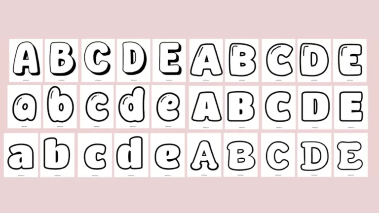
Alphabet Bubble Letters Easy Steps, Styles & Tips for Beginners
How to install individual letters accurately
Installation varies by product and surface. Always follow the manufacturer’s fixing instructions, especially where adhesive type, hole diameter, spacing hardware, or load limits are specified. The general method below suits many individually mounted letters, but it is not a substitute for product-specific guidance.
- Plan the layout. Measure the available space and mark a horizontal baseline with a level. Check spelling, character order, and the gap between words before drilling.
- Use the supplied template if available. Tape it flat and level in the final position. If there is no template, make one from paper or cardboard to establish spacing.
- Check the wall material. Brick, stone, timber, render, tile, and cladding require different drill bits, anchors, sealants, and techniques. Avoid drilling where hidden cables or pipes may be present.
- Make pilot holes carefully. Drill only as deep and wide as required. On brittle tile, stone, or delicate render, incorrect drilling can cause cracks or chips.
- Fit anchors or studs. Use suitable wall plugs, masonry anchors, screws, or stand-off fixings. For adhesive-mounted products, clean and dry the surface thoroughly and allow the adhesive to cure as directed.
- Mount and align. Press or fasten each letter into place, then step back to confirm it looks level from the normal viewing point.
Heavy letters, uneven stonework, insulated exterior finishes, and fragile cladding may require a more specialized fixing approach. A qualified installer can help where the surface is valuable, difficult to repair, or structurally uncertain.
Common mistakes to avoid
- Choosing letters based only on a close-up photo rather than road-distance visibility.
- Using a decorative font that makes the name difficult to read quickly.
- Selecting a finish that blends into the wall in shade or glare.
- Mounting letters too close together, so a long name becomes visually crowded.
- Ignoring the condition and composition of the wall before drilling.
- Using indoor-grade adhesive or fixings outdoors.
- Letting shrubs, climbing plants, or a new fence obscure the address over time.
Caring for exterior address letters
Regular gentle cleaning keeps lettering readable and helps reveal loose fittings early. For many materials, wiping with water and a soft cloth is enough. Avoid abrasive pads, harsh solvents, and strong cleaners unless the manufacturer confirms they are safe for the particular finish.
Check letters after severe weather, especially if they are mounted on exposed posts or gates. Re-tighten compatible mechanical fixings only when necessary, and inspect sealant around drilled holes if water entry is a concern. Wood may need refinishing periodically, while metals with a natural patina should be cleaned only if preserving a bright finish is the goal.
Frequently asked questions
Should house letters include a number as well as a name?
Usually, yes. A house name can be distinctive, but a visible street number generally makes identification faster and clearer. Use the address format expected by local postal and municipal services.
Can I stick house letters directly to brick?
Some exterior-rated adhesives may work on sound, smooth brick, but rough, dusty, damp, or flaky surfaces reduce adhesion. Stud-mounted or screw-fixed letters are often more secure on masonry. Follow the letter maker’s instructions for the specific surface.
What color letters work best on a brick house?
Choose a color that clearly contrasts with the particular brick. Pale letters may stand out on dark red or brown brick, while dark letters can work on pale brick. View samples outdoors in daylight and shade before deciding.
How far apart should individual letters be?
Use the spacing shown on the supplied template or follow the typeface’s natural proportions. Equal physical gaps are not always visually equal, because letter shapes differ. Lay out the complete name first and judge it from a distance.
Do house letters need to be lit?
Lighting is helpful where visitors need to find the address after dark, but it is not always necessary. Large, contrasting letters in a location that receives nearby ambient light may be sufficient. If lighting is added, avoid glare and shadows that reduce readability.
Conclusion
The most successful house letters are easy to find, easy to read, and suited to the building rather than chosen only for a close-up appearance. Prioritize a clear location, adequate character size, strong contrast, weather-appropriate materials, and secure fixings. With those basics in place, the style can express the character of the home without sacrificing a practical purpose.