Merry Christmas in Bubble Letters Ideas And Spacing Tips
Merry Christmas in bubble letters is a cheerful hand-lettered style for cards, gift tags, posters, classroom displays, and holiday signs. Bubble letters are thick, rounded outline letters with open space inside, so they are easy to color, shade, pattern, or decorate. You do not need advanced calligraphy skills: start with a light pencil outline, keep each letter wide and rounded, then trace and decorate it.
The best result is usually clear rather than complicated. Make the words easy to read first, then add festive colors, snow, lights, holly, or other small details around and inside the letters.
How to write Merry Christmas in bubble letters
Write the phrase in two lines, using big rounded block letters. Leave a small, even gap between letters so their outlines do not run together, then add color and decorations after the word shape is complete.
- Plan the layout. Lightly draw a horizontal guide for each word. “Merry” is often placed on the top line and “Christmas” on the second line because Christmas is longer.
- Sketch simple block letters. Write the phrase lightly in pencil. Use uppercase, lowercase, or a mix, but keep the style consistent. Rounded uppercase letters are especially easy for beginners.
- Make each stroke thicker. Draw a second line around each original letter to create a puffy outline. Round off sharp corners rather than making them square.
- Keep counters open. The enclosed spaces in letters such as A, D, O, P, R, and e should remain visible. These openings help people read the words quickly.
- Check spacing before tracing. Make sure nearby letters are close enough to feel like one word, but not so close that their outlines touch. Narrow letters such as I can need a little more surrounding space.
- Trace the final outline. Use a marker, fineliner, or dark colored pencil only after you like the penciled shapes. Erase visible pencil marks once the ink is dry.
- Add color, shadows, or patterns. Fill the letters with one color, alternate colors, or leave them white and decorate the interior with small patterns.
Choose a bubble-letter style that fits the project
Bubble lettering can be simple and playful or more decorative. Pick one main style before you begin so the two words look like they belong together.
| Style | How it looks | Works well for |
|---|---|---|
| Classic outline | Large rounded letters with a blank center | Coloring pages, signs, and young children’s crafts |
| Filled letters | Solid red, green, blue, gold, or another holiday color | Quick cards and bold posters |
| 3D bubble letters | A second offset edge creates a raised look | Gift bags, banners, and display lettering |
| Pattern-filled letters | Stripes, dots, candy-cane lines, stars, or snowflakes inside | Handmade cards and detailed artwork |
| Faux lights | Small colored dots or bulb shapes follow the letter edges | Festive signs and digital designs |
Easy ways to draw cleaner rounded letters
The secret to good bubble lettering is not perfect handwriting. It is using simple shapes and giving every letter a similar thickness.
Cute Bubble Letters Easy Step-by-Step Guide for Beginners
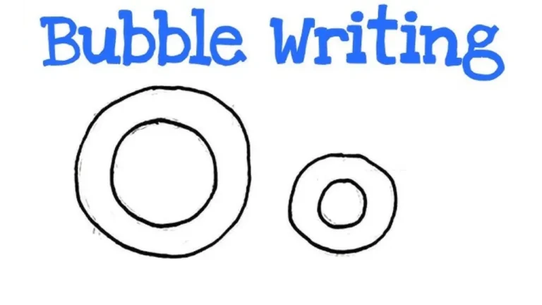
- Build letters from shapes. An O can start as an oval; a B can be a tall stem with two rounded loops; an S can be drawn as a wide, soft curve.
- Use a consistent stroke width. If one letter is very thick and the next is thin, the phrase can look uneven. Aim for roughly the same outline width throughout.
- Round the ends. Soft, circular ends make the lettering feel more like bubbles. This matters most on letters such as C, J, S, and Y.
- Make tall letters comparable in height. Capitals should generally share a top and bottom boundary. If you use lowercase letters, keep ascenders such as h, l, and t similar in height.
- Step back from the page. Looking at the layout from a short distance makes uneven spacing and tilted words easier to spot.
Color and decoration ideas for Christmas lettering
Once the outline is done, the empty interior becomes part of the design. Limit the palette to two or three main colors if you want a clean look, or use a fuller set of colors for a playful children’s project.
Traditional red and green
Color “Merry” red and “Christmas” green, or alternate the colors from letter to letter. A thin black, dark green, or dark red outline keeps bright fills readable. Add small white dots for a snowy effect.
Alphabet Bubble Letters Easy Steps, Styles & Tips for Beginners
Candy-cane stripes
Draw diagonal red stripes across white bubble letters. Keep the stripes parallel and follow the direction of the letter shape. This is easier when the letters are fairly large, since narrow areas can become crowded.
Snowy letters
Fill letters in blue, purple, or icy turquoise. Add a white band along the top edge of each letter to suggest settled snow, then place a few small snowflakes around the words. A white gel pen can work well over darker color.
Gold, silver, and winter neutrals
For a more restrained card or place setting, use gold or silver lettering with deep green, navy, cream, or white around it. Metallic pens and paper can be harder to photograph clearly, so a dark outline may help the letters stand out.
Holiday characters and objects
Use decorations sparingly so they do not hide the words. A Santa hat can sit over the M, a holly sprig can tuck into a corner, or a string of tiny lights can curl around the outside of the phrase. Small stars, ornaments, bows, and snow dots also work well.
Make a simple 3D bubble-letter effect
A 3D effect adds depth without changing the basic lettering. Draw the normal bubble letters first, then repeat part of the outline slightly below and to one side.
- Finish the front outline of each letter.
- Choose one shadow direction, such as down and to the right.
- Draw a second edge a short, equal distance away in that direction.
- Connect the front and back edges along the lower and right sides.
- Color the front brightly and use a darker version of that color on the side surfaces.
Keep the offset small. A large offset can make the word difficult to read, especially in the tighter spaces of “Christmas.”
Layouts for cards, posters, and gift tags
The same phrase needs different proportions depending on where it will appear. Plan the lettering around the available space instead of trying to shrink a detailed design at the end.
- Greeting card front: Center the words on two lines. Leave room for a small illustration below or a border around the edges.
- Poster or classroom display: Use very large letters with a broad outline. High contrast matters more than small internal details because the words may be viewed from across a room.
- Gift tag: Write “Merry” above “Christmas” in compact letters, or use only “Merry” on the tag and add the recipient’s name. Avoid 3D shading if the tag is tiny.
- Window or chalkboard sign: Use thick outlines and simple fills. A white paint marker or chalk marker on a dark surface makes the phrase highly visible.
- Coloring activity: Draw broad, unfilled outlines and leave generous space between letters. Children can add their own colors and patterns without the design becoming muddy.
Common mistakes and quick fixes
Most lettering problems can be fixed before the final outline goes on. Work lightly in pencil and make small corrections as you build the word.
- The phrase does not fit: Reduce the width of a few letters, not just the final one. You can also move “Christmas” to its own line or use a slightly smaller size for it.
- Letters merge together: Erase a little of the outer outline between them. Add more space around rounded pairs such as O and C, or R and S.
- The letters look wobbly: Smooth one curve at a time instead of tracing every pencil bump. A flexible ruler or circular object can help with larger rounded sections.
- The decoration overwhelms the words: Remove details from the letter interiors and move them to the background, corners, or border.
- Marker bleeds through paper: Put scrap paper underneath, use a heavier sheet, or color with pencils instead. Test a small hidden area when using a new marker.
Frequently asked questions
Should “Merry Christmas” be written in capital letters?
Capital letters are easier to make bold and even, but they are not required. All caps suit posters and signs, while mixed case can feel softer and more like handwriting. Choose the option that fits the space and keep the letter style consistent.
What is the easiest way to make bubble letters?
Write ordinary block letters in pencil, then draw a wider rounded outline around each one. This method gives you a guide for the word while letting you control the final thickness.
What colors work best for bubble Christmas letters?
Red, green, white, gold, blue, and silver are common choices, but contrast matters most. Dark outlines around light fills, or light details on dark fills, help the words remain readable.
Can I make bubble letters without markers?
Yes. Colored pencils, crayons, gel pens, paint, chalk, and digital drawing tools can all create the look. Pencil colors are useful for blending and shading, while markers give strong, flat color.
How do I add snow to bubble letters?
Draw an uneven white strip along the upper edge of each letter, with small rounded drips in a few places. Keep it thin enough that the original letter shape is still easy to recognize.
Conclusion
The strongest Merry Christmas in bubble letters design starts with wide, rounded, readable shapes. Sketch lightly, give the words enough room, and choose just a few colors or festive details that suit the project. Whether the result is a simple outline for coloring or a shaded 3D sign, the clear letterforms are what make the holiday message stand out.