School in Bubble Letters Easy Drawing Guide
School in bubble letters is a fun lettering design made by turning the word “SCHOOL” into large, rounded, outlined characters. Start with lightly written block letters, draw a second line around each letter to make it thick and puffy, then erase the inner guide lines. It works well for classroom posters, school projects, notebook covers, and handmade signs.
The best bubble lettering is easy to read before it is decorated. Keep each letter wide, leave small gaps between letters, and use one consistent outline thickness across the word.
How to write school in bubble letters
Write the word in simple capital letters first, then build rounded space around those letters. Capitals are usually the easiest choice because the repeated O shapes create a balanced, playful look.
- Write SCHOOL lightly in pencil. Use tall, plain block capitals. Do not press hard; these are only guide letters.
- Leave room between each letter. A narrow gap prevents neighboring outlines from running together, especially between the S and C and around the two Os.
- Draw an outer outline. Follow the shape of each letter, staying a similar distance from the guide line all the way around. Round sharp corners as you go.
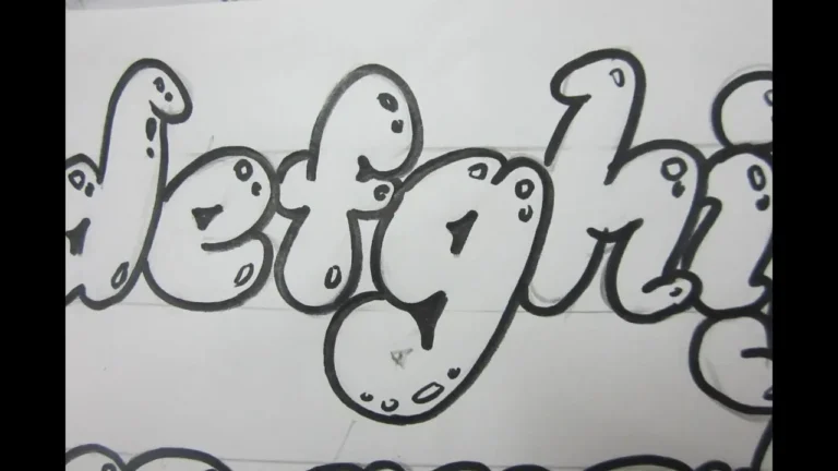
- Round the ends and corners. Bubble letters look soft and inflated. Give the top and bottom bars of the H and L curved ends rather than squared-off edges.
- Shape the inside holes. The O letters need a smaller oval opening inside each large outer oval. The inner oval should follow the same general shape as the outer edge.
- Erase the original guide letters. Once the outer shapes are clear, erase pencil marks inside the thick strokes. Keep the inner openings of the Os.
- Trace and decorate. Outline the finished letters with a pen or marker if desired. Add color, shadows, patterns, or highlights only after the basic word is readable.
Letter-by-letter guide for SCHOOL
Each letter has a simple bubble-letter structure. Drawing them separately first can make the whole word easier to arrange.
| Letter | How to form it | Useful tip |
|---|---|---|
| S | Draw a broad, curving S with a second rounded line around it. | Keep the middle bend open enough that the S does not resemble an 8. |
| C | Make a thick, open oval with a gap on the right side. | Round both ends evenly to match the soft style. |
| H | Draw two thick upright stems joined by a thick middle bar. | Make all three strokes similar in width. |
| O | Draw a large oval and a smaller oval inside it. | Center the inner opening so the outer stroke looks even. |
| O | Repeat the first O in the same size and shape. | Matching the pair makes the word look tidy. |
| L | Draw a thick vertical stem that bends into a rounded bottom bar. | Give the lower-right end a soft, curved finish. |
Use a simple layout before you draw
A quick pencil layout avoids crowded lettering. Draw a faint baseline beneath the word and a second guideline above it. Make the C, H, and L roughly the same height, and keep the two Os close in size.
For a centered title, sketch the middle letters first. In “SCHOOL,” the H sits near the center, so placing it first can help you distribute the other letters to either side. If the word will go on a narrow page, make the letters slightly taller rather than squeezing them too tightly.
Cute Bubble Letters Easy Step-by-Step Guide for Beginners
Ways to decorate bubble letters
Once the outline is complete, decoration can give the word a school-theme look without making it hard to read. Pick one or two effects rather than filling every empty space with different patterns.
- Solid color: Fill each letter with one crayon, colored pencil, marker, or paint color.
- Alternating colors: Use a repeating sequence, such as two or three colors, across the letters.
- Drop shadow: Add a second offset outline behind and slightly below the word. Keep the offset direction the same for every letter.
- Highlights: Leave or add small white curved marks near the upper-left side of each letter for a shiny, inflated effect.
- Patterns: Try dots, stripes, checkerboards, stars, or tiny hearts inside the letters. Use a pattern that remains visible from a short distance.
- School-themed details: Add small pencils, books, rulers, apples, or stars around the word instead of crowding the letter interiors.
- Blackboard style: Use white or pale chalk-like lines on dark paper. A slightly uneven edge can suit this style.
How to make the letters look more three-dimensional
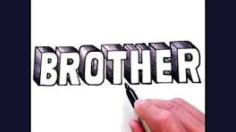
A shadow is the easiest way to make bubble letters appear raised. Choose one direction, such as down and to the right, and draw a duplicate edge in that direction behind each letter. Connect the matching edges to create a thick side surface.
Alphabet Bubble Letters Easy Steps, Styles & Tips for Beginners
Color the front of the letters lighter and the side surface darker. For a simpler result, draw only a thin black shadow line. Highlights on the opposite side can strengthen the puffy effect, but they are optional.
Easy shadow rule
Imagine light coming from the upper left. Put pale highlights near the upper-left curves and place shadows along the lower-right edges. Keeping that direction consistent matters more than adding many details.
Common mistakes and how to fix them
Bubble lettering is forgiving, but a few issues can make the word difficult to read. Most can be corrected before you trace the final outline.
- Uneven stroke width: If one letter looks thin and another looks bulky, adjust the outer outline before erasing your guides.
- Letters touching: Separate outlines that merge accidentally. A small white gap makes each character clearer.
- Very small O openings: Enlarge the inner ovals. Tiny holes make the Os look like solid circles.
- A cramped C: Widen the opening on the right side so it does not read as an O.
- Too much decoration: Keep the main shapes bold. A clean outline often looks better than several competing patterns.
- Marker bleeding: Let one color dry before adding another, especially on thin paper. Using heavier paper can also help.
Materials that work well
You only need a pencil and eraser to practice the shape. A finished design, choose supplies based on the paper and the effect you want.
- A pencil and soft eraser for sketching
- A black fineliner or marker for crisp outlines
- Crayons or colored pencils for easy blending and less bleed-through
- Markers for bright, solid fills
- Thicker drawing paper, cardstock, or a poster board for signs
- A ruler for light baseline and height guides
For young children, thick crayons and washable markers make rounded strokes easier to control. For detailed lettering, colored pencils allow more gradual shading and small highlights.
Printable-style practice method
Practice on lined or graph paper before making a final sign. First draw plain versions of S, C, H, O, O, and L in separate boxes. Next, add the rounded outer outline to each letter. After that, join them into the full word while keeping the same height and thickness.
This method also helps with hand-lettered classroom work. Once the basic form feels comfortable, vary the word with a taller style, wider Os, or a bolder shadow while preserving legibility.
Frequently Asked Questions
Should SCHOOL be written in uppercase or lowercase bubble letters?
Uppercase letters are usually easier for beginners because they have simpler proportions and look strong on posters. Lowercase bubble letters can work too, but letters such as h and l may need more careful spacing.
How thick should a bubble-letter outline be?
There is no fixed measurement. The outline should be thick enough to look rounded but thin enough to leave clear gaps between letters. Consistent thickness is more important than exact size.
Can I draw bubble letters without tracing block letters first?
Yes. With practice, you can draw the outer shape directly. Starting with light block letters is helpful because it keeps the word evenly sized and makes corrections easier.
What colors suit a school poster?
High-contrast combinations are easiest to read, such as dark outlines around bright fills. Use colors that fit the poster’s topic, and leave enough contrast between the letters and the background.
How can I make the word fit on a small page?
Reduce the width of the letters slightly, but do not remove all the spacing. You can also stack the word or use a tall, narrow bubble style with smaller decorative details around it.
Conclusion
The key to school in bubble letters is a clear foundation: lightly sketched capitals, evenly rounded outlines, open spaces between characters, and matching O shapes. Once the word reads easily, color and decorations can give it personality. A simple outline with a neat shadow often has more impact than a crowded design.