Bubble Letters F How to Draw and Style It
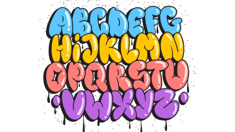
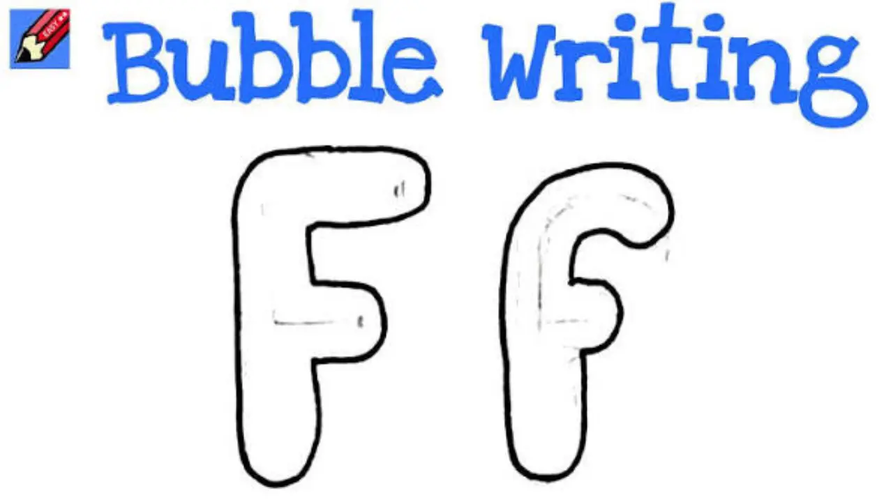
Bubble letters F are a rounded, oversized version of the letter F. They are made with thick strokes, curved corners, and an outline that gives the letter a soft, puffy appearance. You can draw a capital or lowercase F with a pencil and paper, then color, shade, or decorate it for posters, cards, graffiti-style art, and school projects.
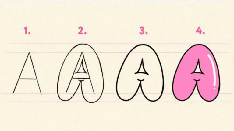
The easiest method is to first sketch a plain block letter, widen its strokes evenly, round the corners, and add an outline. Start lightly so you can correct the shape before tracing the finished lines.
What makes an F a bubble letter?
A bubble letter keeps the basic structure of an F but replaces sharp, narrow lines with wide, rounded forms. The vertical stem is usually the thickest part. The top bar and middle bar are shorter horizontal arms, and both should look smoothly attached rather than drawn as thin lines.
There is no single correct design. Some bubble Fs are tall and simple, while others have dramatic curves, extra-wide bars, small gaps, or decorative highlights. The main goal is readability: it should still look like an F at a glance.
How to draw bubble letters F step by step
Use a pencil, eraser, paper, and a dark pen or marker for the final outline. Colored pencils, crayons, or markers are optional for decorating the finished letter.
- Draw a light guide shape. Sketch a tall vertical rectangle for the main stem. Add a long rectangle at the top and a shorter rectangle about halfway down for the two arms of a capital F.
- Make every stroke thick. Give the stem and arms enough width to look inflated. Keep the widths fairly consistent, especially at the places where the arms connect to the stem.
- Round the outer corners. Replace square corners with gentle curves. The upper-left and lower-left edges of the stem can also be rounded so the letter feels soft rather than boxy.
- Smooth the joins. Where the top and middle arms meet the vertical stem, erase hard inside angles and redraw them as curved connections. This makes the parts look like one puffy shape.
- Refine the silhouette. Check that the top arm is longer than the middle arm. Make small adjustments until the letter looks balanced and remains easy to recognize.
- Trace the final outline. Go over the outer edge with a pen or marker. Let the ink dry before erasing pencil guidelines.
- Add color and details. Fill the letter, add a second outline, or use highlights and shadows to create depth.
Simple capital F shape to remember
A capital bubble F has three main parts: one tall vertical stem, one long top arm, and one shorter middle arm. Unlike an E, it does not have a bottom arm. Leaving the bottom of the stem plain is one of the easiest ways to keep the letter clear.
| Part of the letter | How to shape it |
|---|---|
| Vertical stem | Make it tall, wide, and gently rounded at the bottom. |
| Top arm | Make it the longest horizontal section and round its far end. |
| Middle arm | Keep it shorter than the top arm, usually around the letter’s middle. |
| Connections | Blend them into the stem with curves instead of sharp right angles. |
Drawing a lowercase bubble f
A lowercase f is less standardized because printed and handwritten forms vary. It often has a tall curved stroke, a small crossbar, and either a loop or a rounded descender. For a bubble version, choose one simple lowercase style and exaggerate its thick, rounded shape.
Begin with a light centerline that shows the direction of the letter. Draw two parallel curved lines around it to make a thick stroke. Add the crossbar across the middle, then round every end and connection. If the lower part dips below the baseline, keep that curve broad enough that it does not resemble a lowercase t.
Cute Bubble Letters Easy Step-by-Step Guide for Beginners
For beginners, a capital F is usually easier because its structure is clearer and it offers larger spaces for color and patterns.
Ways to decorate bubble letters F
After the outline is finished, decoration can turn a plain letter into a bold piece of lettering. Pick one main style rather than adding every effect at once; too many patterns can make the F difficult to read.
Use a double outline
Draw a second line outside the letter, following its contours at an even distance. This creates a sticker-like border. A dark inner outline with a lighter outer border is a simple high-contrast option.
Add highlights for a puffy look
Place small white or uncolored oval marks near the upper-left edges of the letter. Keep the highlights in similar positions on each section. They suggest light reflecting from a rounded surface.
Add a shadow for depth
Draw a duplicate edge slightly down and to one side, then connect it back to the letter. A shadow placed consistently to the lower right can make the F appear raised above the page. For a quicker method, add a darker band just inside one side of the letter.
Alphabet Bubble Letters Easy Steps, Styles & Tips for Beginners
Fill the letter with a pattern
- Polka dots, hearts, stars, or small flowers for a playful design
- Stripes or a checker pattern for a graphic look
- Two or more blended colors for a gradient effect
- Animal-print-inspired spots or scales for a themed project
- Small doodles connected to a word that begins with F, such as flowers, fish, or footballs
Color choices that keep the letter readable
Contrast matters more than using many colors. A dark outline around a lighter fill is easy to see from a distance. If the fill is dark, use a light outline or highlights so the curved edges remain visible.
For a three-dimensional effect, choose one base color. Add a lighter version of that color toward the assumed light source and a darker version on the opposite side. Keeping the light and shadow direction consistent is more convincing than using a large number of shades.
Common mistakes and easy fixes
Bubble lettering is forgiving, but a few shape problems can make an F look uneven or turn it into another letter.
- It looks like an E: Remove any bottom horizontal arm. A capital F has only the top and middle arms.
- The arms look too thin: Widen them before adding details. Bubble letters need broad, rounded strokes.
- The middle arm is too long: Shorten it so the top arm remains visually dominant.
- The corners are still boxy: Round both the outer corners and the inner connections where the arms meet the stem.
- The outline wobbles: Sketch with pencil first. Draw slowly in short, confident curves rather than trying to make one long line.
- Decorations hide the shape: Leave a clear border near the outline and use simpler patterns in narrow areas.
Practice ideas for better bubble lettering
Practice the same F in several sizes before trying a final design. Large letters make it easier to control the curves and see where the stroke width changes. Once the shape feels natural, experiment with a narrower or wider style.
A useful exercise is to draw a normal block F first, then trace around the outside at a consistent distance. This creates a thick outline that can be rounded and cleaned up. Another exercise is to write a word beginning with F—such as “fun,” “friend,” or “flower”—and make only the F a bubble letter. It helps you see how decorative lettering works alongside regular writing.
Frequently asked questions
How do you make a bubble F look 3D?
Add a shadow that follows one consistent direction, such as down and to the right. Connect the shadow to the main outline, then use a darker color on the shadow and a lighter highlight on the opposite side.
Should bubble letters have sharp corners?
Usually no. Rounded corners and smooth joins are what create the inflated bubble effect. Slightly squared areas can work in a stylized design, but the main outline should still feel soft and thick.
Can a bubble letter F be used in graffiti-style art?
Yes. Bubble lettering is a common lettering style in graffiti-inspired art because its thick outlines and rounded shapes are easy to color and layer. Use it on paper, sketchbooks, or other surfaces where you have permission to create art.
What is the easiest tool for outlining bubble letters?
A black felt-tip pen or marker gives a clear outline after the pencil sketch is complete. Use a tip size that matches the size of the letter; very small letters need a finer pen than poster-sized lettering.
Conclusion
The best bubble letters F begin with a recognizable capital or lowercase form, then use thick strokes and rounded edges to give it personality. Build the shape lightly, refine the proportions, and add only the colors, outlines, highlights, or patterns that support your chosen style. With a few practice sketches, the same simple letter can become playful, bold, polished, or fully decorative.