Back to School in Bubble Letters Easy Lettering Ideas
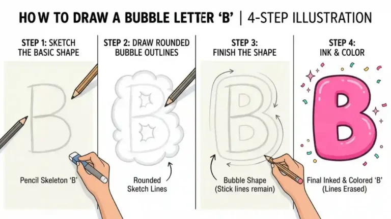
Back to school in bubble letters is a fun, rounded lettering style often used on classroom signs, locker decorations, notebook covers, posters, and school projects. The basic method is simple: write the words lightly, draw a puffy outline around each letter, erase the original guide lines, then add color, shadows, or patterns. Clear spacing matters more than perfect symmetry.
You can make the phrase look playful with thick letters and bright colors, or keep it neat and simple with a single outline. Start with a pencil so you can adjust the size and placement before using markers or paint.
How to write back to school in bubble letters
Write the phrase in large, simple letters first, then build a smooth rounded border around each one. Avoid sharp corners and tight gaps; bubble lettering looks best when each letter has room to look soft and full.
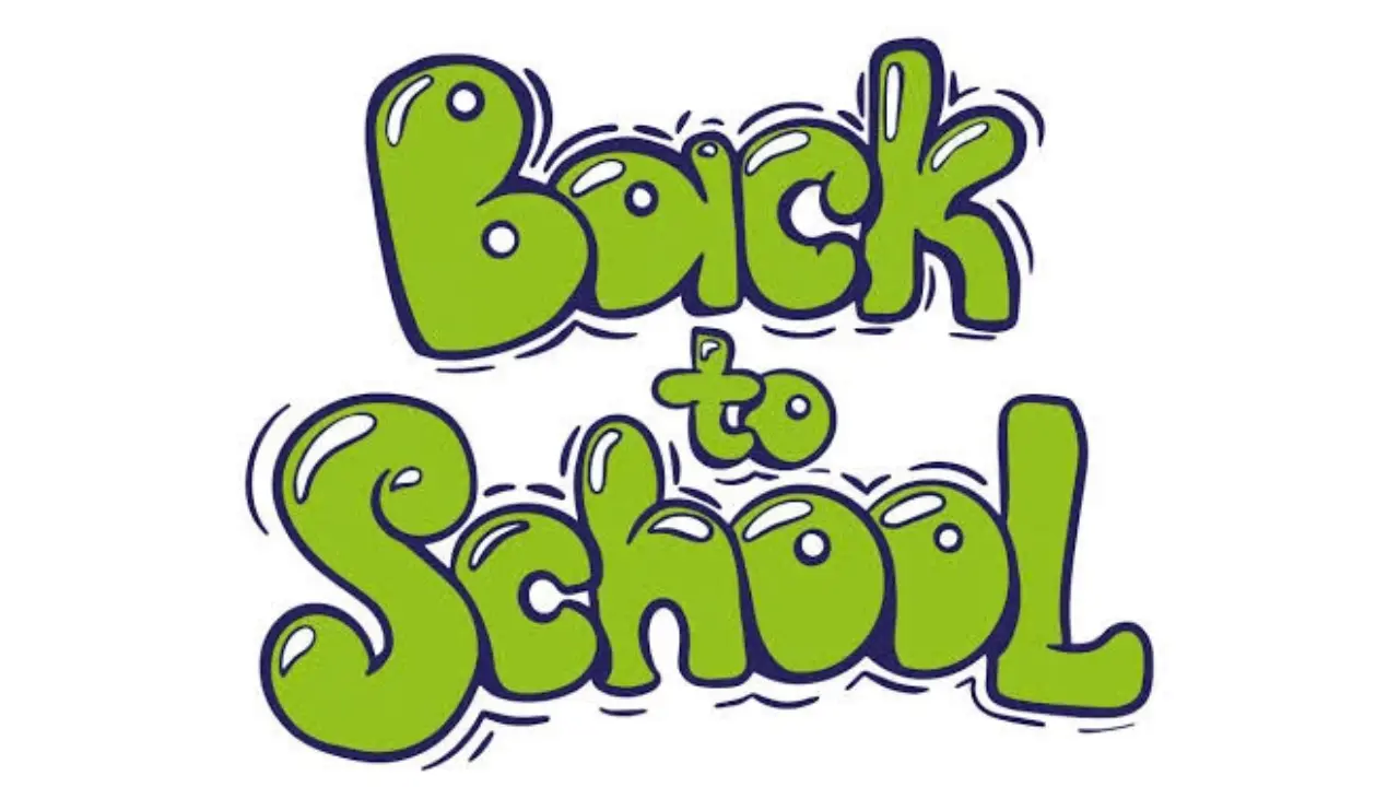
- Plan the layout. Decide whether the words will sit on one line, two lines, or three lines. For most paper sizes, placing “BACK” on top, “TO” in the middle, and “SCHOOL” at the bottom makes the design easier to read.
- Sketch guide lines. Use a ruler to make faint horizontal lines for the top and bottom of the letters. This keeps different letters at a similar height.
- Write the words lightly. Use uppercase block letters for the easiest starting point. Leave a small space between letters so the outlines will not run together.
- Round each letter. Trace around the outside of every letter with a wider, curved shape. Turn corners into curves. Make straight strokes look thick and pillowy.
- Erase the inner sketch. Once the outer outline looks right, carefully erase the original thin block letters. You should be left with hollow, rounded letter shapes.
- Outline and decorate. Trace the final letters with a darker pen or marker. Fill them with color, stripes, dots, highlights, or a shadow.
Work on one word at a time rather than outlining the entire phrase in a single pass. This makes it easier to notice uneven spacing before the ink is permanent.
Cute Bubble Letters Easy Step-by-Step Guide for Beginners
Choose a layout before you start
The phrase has uneven word lengths, so a layout helps prevent “SCHOOL” from looking crowded. A stacked design is usually the most balanced choice, especially for a poster or standard notebook page.
| Layout | Best for | How it looks |
|---|---|---|
| Three lines: BACK / TO / SCHOOL | Posters, door signs, title pages | Bold and balanced; gives “SCHOOL” the most room |
| Two lines: BACK TO / SCHOOL | Wide banners and landscape paper | Clean and easy to read from a distance |
| One line: BACK TO SCHOOL | Long labels or digital headers | Compact, but needs smaller letters or a wide space |
| Arched words | Decorative signs and cards | Playful; works well with school-themed drawings underneath |
Make “SCHOOL” slightly larger than “BACK TO” if it is the main visual focus. Another option is to put “TO” inside a small pencil, apple, star, or badge shape between the two larger words.
What makes a letter look like a bubble letter?
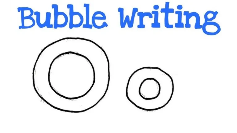
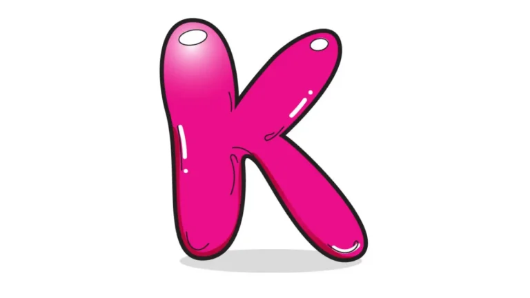
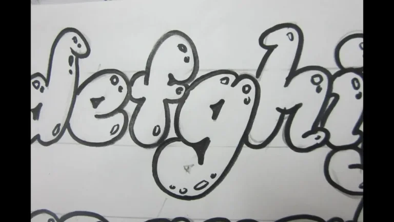
Bubble letters are thick, rounded letters with a soft, inflated appearance. They are not one fixed alphabet; the style comes from a few consistent choices.
- Wide strokes: Each part of the letter has visible thickness.
- Rounded ends and corners: Sharp points are softened into curves.
- Open counters: The inside spaces of letters such as A, B, D, O, P, R, and S stay clear enough to read.
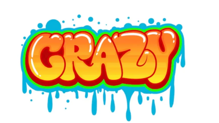
- Even spacing: Letters should not touch unless you deliberately want a connected graffiti-style effect.
- Simple shapes: Plain uppercase letters are easier to recognize after they are made puffy.
A bubble-letter alphabet does not need to be perfectly round. A tall, narrow letter can still work if its edges are curved and its strokes look thick. Readability should guide the design, particularly when the lettering will be seen across a classroom.
Alphabet Bubble Letters Easy Steps, Styles & Tips for Beginners
Easy styling ideas for a school-themed design
Once the letters are outlined, color and small details can turn plain lettering into a school-themed title. Choose two or three main colors so the design stays organized rather than busy.
Color-block letters
Fill each word with a different color, such as one color for “BACK,” another for “TO,” and a third for “SCHOOL.” Use a black or dark blue outline to separate the letters from the background. This is a good choice for young artists because it is quick and clear.
Notebook-paper effect
Fill the letters white or a pale color, then add thin blue horizontal lines inside them and a red vertical margin line on one side. Keep the lines clipped within the letters. A darker outline helps the paper effect stand out.
Chalkboard style
On black, dark green, or dark blue paper, draw the bubble letters in white, pale yellow, light blue, or pink. Use colored pencil, chalk markers, or opaque paint pens that show on dark surfaces. A slightly uneven texture can suit the chalkboard look.
Pattern fills
Instead of one solid color, fill each letter with a simple repeated pattern. Good school-related options include:
- tiny stars or dots
- diagonal pencil-like stripes
- small checkerboard squares
- mini apples, books, or smiley faces
- rainbow bands
Use a pattern only inside the letters. Adding detailed drawings both inside and outside the lettering can make the words hard to read.
Add depth with shadows and highlights
A shadow makes bubble letters look as if they are lifting off the page. Pick one direction for the shadow, such as down and to the right, and use it consistently behind every letter.
For a simple drop shadow, redraw the outer edge of each finished letter a few millimeters down and right. Connect the matching edges, then fill that new area with a darker shade. You can also make a clean offset outline without filling it in.
Highlights create a shiny, inflated look. Add a small white oval, curved dash, or dot near the upper-left area of each colored letter. Keep highlights in the same general position, since light normally appears to come from one direction.
School doodles that fit around the words
Small drawings can frame the lettering without competing with it. Place them in blank corners, between lines of text, or along the bottom of a sign. Leave a little empty space around the letters so the phrase remains the first thing people notice.
- pencils, crayons, rulers, and scissors
- an apple, backpack, or stack of books
- paper clips, stars, hearts, and smiley faces
- math symbols, letters of the alphabet, or simple shapes
- a school bus or a small globe
If the page is for a specific class, match the doodles to the subject. A science cover might include beakers and planets, while a reading log could use books and speech bubbles.
Common mistakes and quick fixes
Most bubble-letter problems are easy to correct while the design is still in pencil. Slow down at the outlining stage, because that is where the final style takes shape.
- Letters merge together: Leave more space between the original block letters, or make the bubble outline thinner.
- Some letters look much larger: Use top and bottom guide lines. Check the height of each word before inking.
- The word is hard to read: Simplify decorative patterns and reopen the inner spaces of letters such as O, A, P, and R.
- The outline looks shaky: Turn the paper as you draw, and make several short, controlled curves rather than forcing one long line.
- Colors look muddy: Limit the palette and allow marker ink or paint to dry before adding another color.
- The design feels flat: Add one consistent shadow or a few small highlights instead of adding many unrelated details.
Materials that work well
A pencil, eraser, paper, and a dark marker are enough for a strong design. Colored pencils are helpful for controlled shading, while markers give bold color. Crayons can create a softer, textured result.
For posters, use thicker paper or poster board so marker ink is less likely to show through. Test markers on a scrap sheet first, especially if you plan to layer colors or use white gel pen highlights. For digital lettering, use a drawing app with separate layers: one for the sketch, one for line art, and one for color.
Frequently asked questions
Should bubble letters be uppercase or lowercase?
Either can work, but uppercase letters are easier for beginners and are usually clearer on signs. Lowercase bubble letters can look friendly and soft, though letters such as a, e, and g may take more practice.
How do you make bubble letters look neat?
Start with faint guide lines, keep stroke thickness similar, and leave even gaps between letters. Outline in pencil first, then ink only after checking the whole word.
What color outline should I use?
Black creates the strongest contrast, but dark blue, dark purple, or dark brown can look softer. Choose an outline that is noticeably darker than the fill color.
Can children make bubble letters without tracing?
Yes. Begin with simple uppercase block letters and add rounded outlines around them. Tracing printed letter shapes can also help younger children understand the form before drawing independently.
How can I fit “BACK TO SCHOOL” on a small page?
Use a two- or three-line layout and make “TO” smaller than the other words. Reduce extra doodles, keep the outlines fairly thin, and leave a narrow margin around the design.
Make the design your own
The best back to school in bubble letters design is one that stays readable while showing your choice of color, pattern, and school-themed details. Sketch lightly, build smooth rounded outlines, and add only the decoration that supports the words. A simple title with a clean shadow often looks better than a crowded page.