Teacher in Bubble Letters Easy Drawing Guide
Here is a simple copy-and-paste style for teacher in bubble letters: Ⓣ Ⓔ Ⓐ Ⓒ Ⓗ Ⓔ Ⓡ. These circled characters are a quick digital substitute for bubble writing. For a true hand-drawn bubble-letter look, write TEACHER in large block capitals, round the corners, add an outline, and decorate the inside of each letter.
Bubble letters are most effective when they are wide, evenly spaced, and easy to read. They work well on classroom signs, appreciation cards, door displays, posters, name tags, and coloring pages.
Copy-ready versions of “Teacher”
Use one of these versions for a message, label, or simple digital design. The exact appearance can vary by device and font.
| Style | Text | Best use |
|---|---|---|
| Circled letters | Ⓣ Ⓔ Ⓐ Ⓒ Ⓗ Ⓔ Ⓡ | Quick messages and simple labels |
| Wide capitals | TEACHER | Headings and poster planning |
| Classic outline starting point | TEACHER | Hand-drawn bubble lettering |
Unicode characters such as circled and full-width letters are not the same as a custom bubble font. They are useful for text, but a drawn outline gives more control over thickness, shading, colors, and decorations.
How to draw teacher in bubble letters
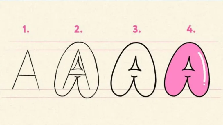
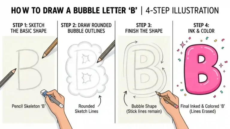
Start with large, simple capital letters, then turn their straight edges and sharp corners into soft, rounded forms. Pencil is helpful for the first draft because it makes spacing and corrections easier.
- Lightly write TEACHER in block capitals. Leave a small, even gap between letters. Make the word wide enough for each letter to have a visible outline.
- Round each letter. Curve the outside corners of the T, E, A, C, H, and R. Keep the letter openings clear, especially inside the A and R.
- Make the strokes thick. Draw a second line around each letter to create a puffy, inflated shape. Try to keep this thickness consistent across the word.
- Erase the original guide lines. Do this carefully once the outer shapes look balanced. The result should still read clearly from a short distance.
- Add an outline. A dark outline makes bubble letters stand out. Leave a narrow white border between the letters and the outline if you want a sticker-like effect.
- Color and decorate. Fill the letters with one color, alternating colors, patterns, or a simple gradient. Add small highlights to make them look glossy.
Letter-by-letter tips for TEACHER
Some letters in this word need a little extra care. Keeping their key shapes visible prevents rounded lettering from becoming hard to read.
Cute Bubble Letters Easy Step-by-Step Guide for Beginners
T: keep the top bar broad
Make the top bar wide with rounded ends, then place a thick vertical stem in the center. Avoid making the stem so wide that the T begins to resemble a plus sign.
E: show all three bars
The E can lose definition when over-rounded. Keep the top, middle, and bottom arms visible. The middle arm is often slightly shorter, which helps preserve the familiar E shape.
A: leave an open center
The A needs a clear triangular or rounded opening near the top-middle. Add a crossbar that is thick enough to see but does not close the opening.
C: make the opening generous
Draw the C like a thick crescent with a clear opening on the right. If the ends nearly meet, it may look like an O.
Alphabet Bubble Letters Easy Steps, Styles & Tips for Beginners
H: connect the uprights cleanly
Use two rounded vertical columns and a centered horizontal bar. Keep the gap above and below the bar open so the H does not look crowded.
R: separate the bowl and leg
Start with a rounded upper bowl like a P, then add a diagonal leg that reaches outward. A clear join between these two parts makes the R easy to recognize.
Easy design ideas for a classroom or card
The word can be formal, playful, or seasonal depending on the colors and small details around it. Choose one main treatment rather than adding every effect at once.
- Rainbow fill: Use a different color for each letter, with a dark outline to keep the word readable.
- Chalkboard look: Use white or pale lettering on a dark background, then add small stars, dots, or an apple shape nearby.
- Pencil theme: Fill letters with yellow, pink, and gray details inspired by a pencil, eraser, and metal band.
- Notebook theme: Place the word over faint horizontal lines and add a red margin line at one side.
- Floral accents: Add small flowers, leaves, or hearts around the outside of the word, not inside the letters.
- Black-and-white coloring page: Use thick outlines only. This leaves room for children or students to color the letters.
How to make the lettering look
A shadow and highlight can make flat bubble letters appear raised. Use both effects in the same direction so the design looks intentional.
First, add a narrow shadow just below and to the right of each letter, as though light is coming from the upper left. A darker shade of the fill color works well. Then add a short curved white highlight near the upper-left area of each letter. Keep highlights small; too many can make the word look cluttered.
For a simpler option, use a double outline: a thin inner outline around the colored letters and a thicker outer outline in a contrasting color. This creates a bold, poster-like result without needing shading.
Spacing, size, and readability
Good bubble lettering should be decorative without sacrificing readability. For the word TEACHER, the repeated E shapes can make the design feel busy if letters are too close together.
- Keep the letters about the same height.
- Make the gap between letters slightly narrower than the width of a letter stroke.
- Leave enough space around the entire word for an outline or shadow.
- Use one thick outline rather than several competing outlines on small paper.
- Check the word from a few steps away before adding small decorations.
If the word is going on a narrow banner, reduce the spaces between letters before making the letters thinner. Thin letters tend to lose the soft, puffy effect that defines bubble writing.
Common mistakes to avoid
The most common problem is rounding letters so much that they stop looking like their intended characters. The goal is not perfect circles; it is a readable letter with soft, inflated edges.
- Closing the C: Keep its right-side opening wide.
- Hiding the A opening: Preserve the inside space and crossbar.
- Uneven outline thickness: A thick outline on one letter and a thin one on another can make the word look unbalanced.
- Overfilling the letters: Large patterns, many stickers, or too much glitter can obscure the word.
- Skipping a draft: Light guide letters make it easier to fit all seven letters on the page.
Printing and digital use
For a printable project, create the word in large plain capitals first, then trace around each letter by hand to build the bubble shape. Print it in black and white if it will be used as a coloring activity. Heavy paper can help when markers, paint, or glue decorations are planned.
For a digital project, choose a rounded display font only if it is available and permitted for the intended use. Font availability and license terms vary. If you need a consistent design for a poster or card, save it as an image or PDF after creating it so the appearance does not change on another device.
Frequently asked questions
What is the easiest way to write TEACHER in bubble letters?
Write TEACHER in large block capitals, draw a rounded outer edge around every letter, erase the inner guide lines, and add a bold outline. Use capital letters first because their shapes are usually easier to keep readable.
Can I copy and paste bubble letters for teacher?
Yes. A simple copyable version is Ⓣ Ⓔ Ⓐ Ⓒ Ⓗ Ⓔ Ⓡ. Its look may differ across apps and devices, so use a hand-drawn or designed version when the exact appearance matters.
What colors work best for bubble lettering?
Bright fills with a dark outline are easy to read. Rainbow colors, two contrasting colors, or one fill color with a lighter highlight are all effective choices.
How can children make bubble letters easier?
Have them begin with lightly penciled block letters, use a broad marker to trace rounded outlines, and color one letter at a time. A simple single outline is usually easier than shadows or detailed patterns.
A simple finished approach
For a clean result, make TEACHER in tall rounded capitals, use a dark outline, fill it with two or three cheerful colors, and add small white highlights. Whether it is drawn for a classroom display, a thank-you card, or a coloring activity, teacher in bubble letters looks best when the shapes stay bold, open, and easy to read.